
Goals & Challenges
This was a product pre-launch project for M!nder, an intelligent theft-deterrence system for Bicycles. As this product did not yet have a proven market, the client was hoping for only quick work rather than a deeply contemplated creation. However, we needed to ensure that the logo would be versatile enough for future packaging and other applications. The client preferred that the logo not focus on theft; instead, his vision centered on the love of one’s bicycle. He was also open to any other inspirations that might spark the designer's creativity.
Resources & Materials
Grasping the product's concept and the reasoning behind its name was crucial. Since the product name had not been finalized at the start of our project, we concentrated on creating a graphic representation that would resonate with the product and align with the client's vision of a "love of bicycles."
Approach & Outcome
As logo designers, we developed three design concepts.
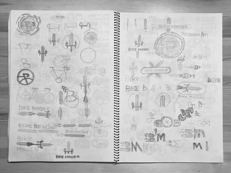
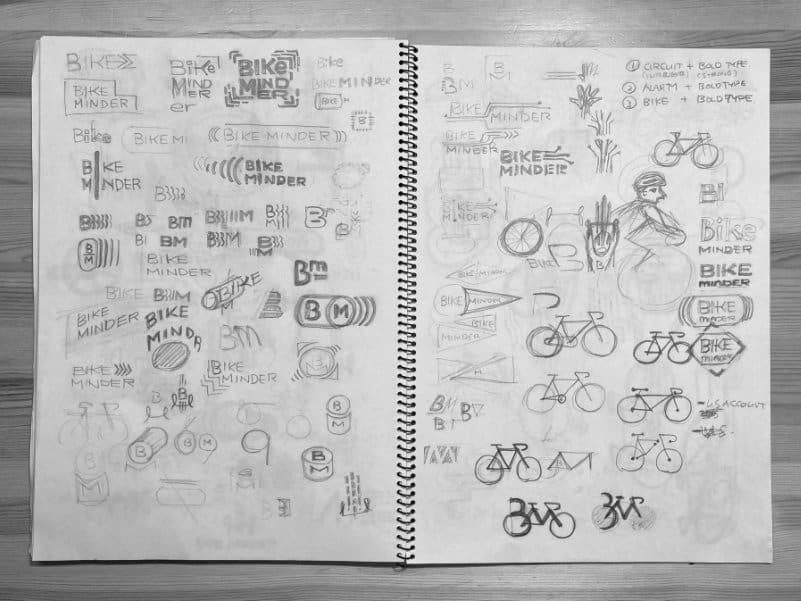
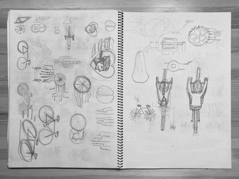
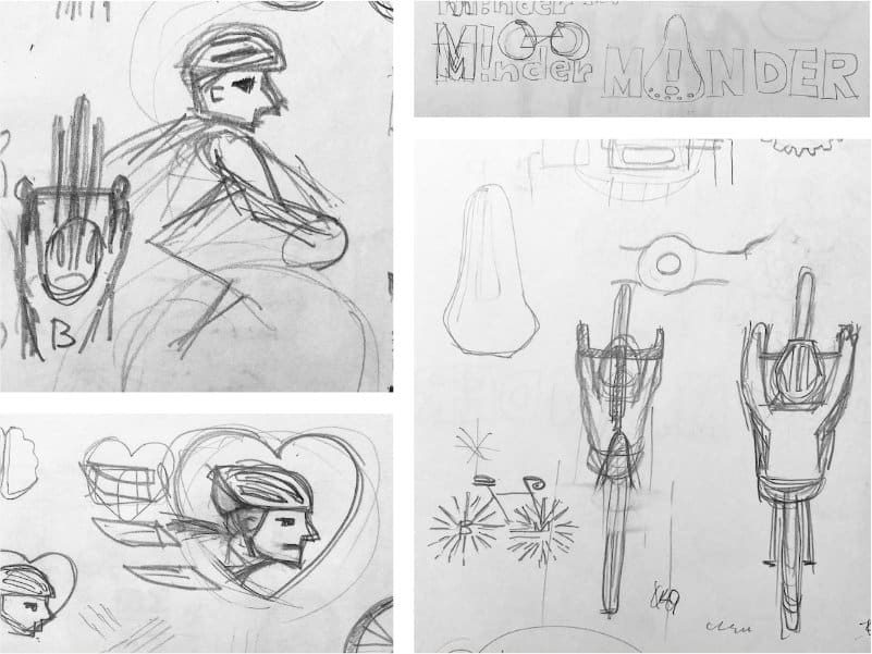
Design exploration
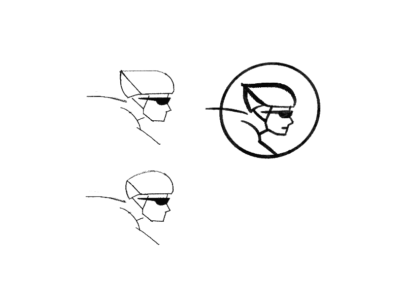
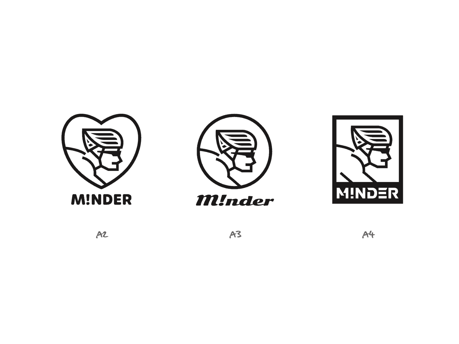
Initial sketch (left) and variations (right)
The client appreciated both the text and illustration of design A. He found the lower-case letters particularly effective with the exclamation mark and the concept of ‘love.’ The client also liked how the illustration was more dominant compared to the name.
Applications & Tools
Adobe Illustrator, Affinity Designer, Artboard Studio
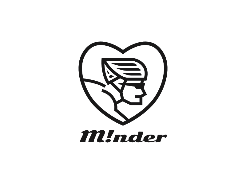
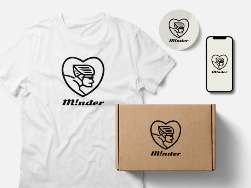
Design A (selected)
Inspired by cyclists’ love for bikes and cycling, we used bold shapes and lines, along with a strong slant font, to represent reliability, robustness, and the feel of the wind.
Other Presented Design - B
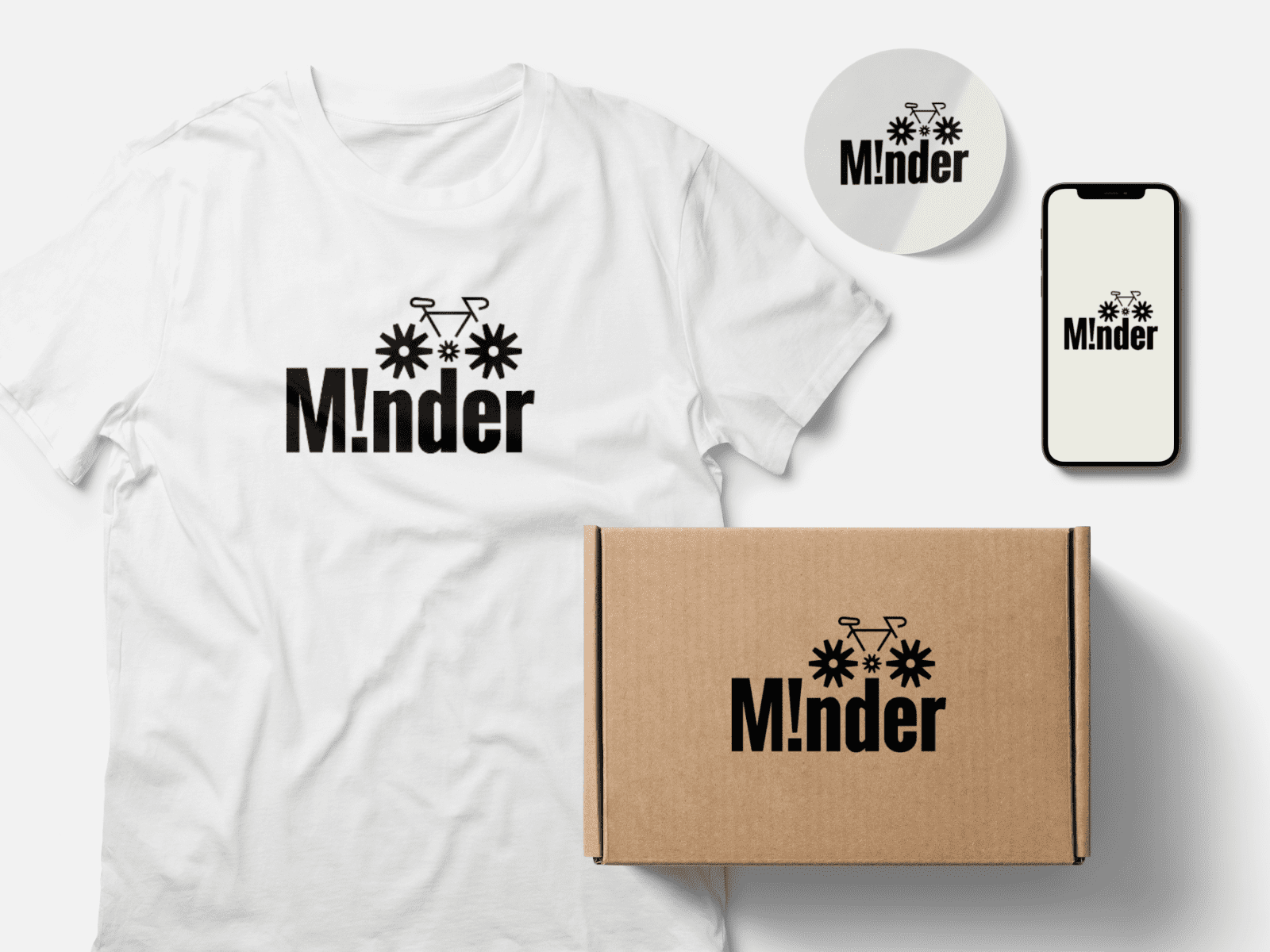
Drawing inspiration from bicycles, we incorporated asterisk symbols to symbolize simplified wheels and alertness, while the bold fonts convey reliability and robustness.
Other Presented Design – C
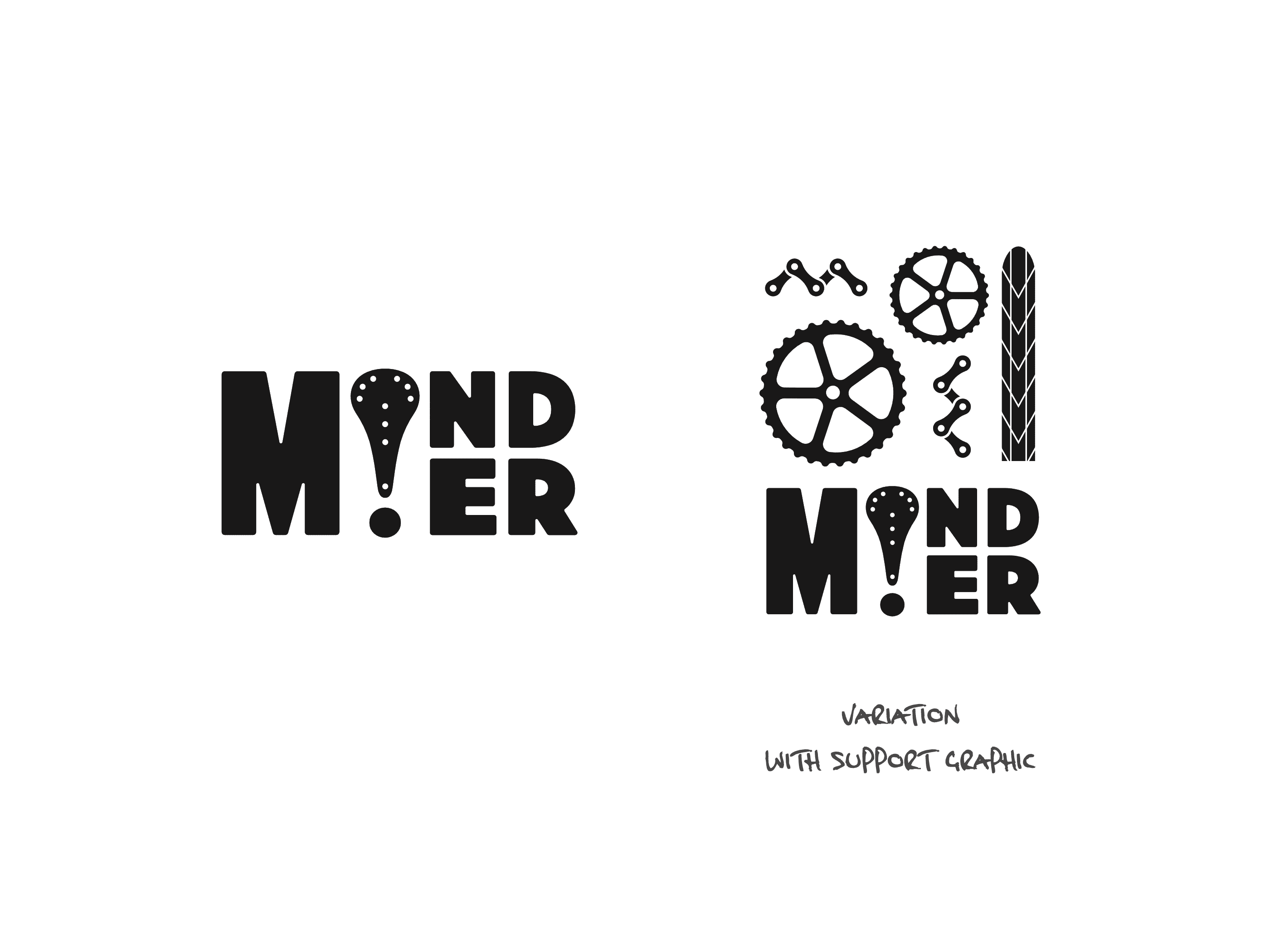
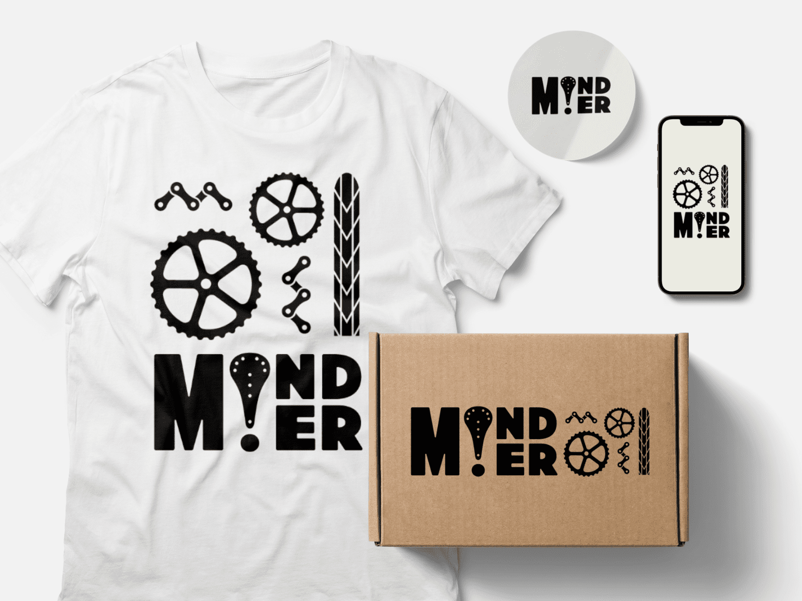
By combining an exclamation mark and a bike saddle, we created a design that uses bold fonts to represent reliability and robustness. This concept may work effectively with or without a supporting graphic of bike parts illustration.