Goals & Challenges
The client was seeking a compact branding solution for a children’s early learning center. The target audience included families with children aged 2.5 to 5 years, as well as parents between the ages of 25 and 45 who value a modern, play-based educational program rather than a traditional academic approach. The client also planned to offer freshly made, to-go meals for kids and eventually develop a kids’ kitchen for sharing recipes.
The client described the center as a unique early childhood program grounded in modern research and centred on love and happiness. Rather than implementing a strictly structured academic program, they focused on providing a holistic learning experience that encourages comprehensive development based on contemporary research.
To launch the business, they required a logo, a website, and labels/packages for the kids’ meals.
Resources & Materials
The client shared comprehensive information about their business, along with a general idea of what they want for their website. This included key business concepts that highlight their uniqueness. We extracted essential words from these key concepts and used them as design keywords for the logo, the overall website design, and the packaging.
Approach & Outcome
As logo and branding designers, we began our brainstorming process by sharing hand-drawn diagrams. This helped us confirm our understanding of the client's key concepts and ensured that both the client and our team were aligned. We developed five logo design concepts; then, with the selected logo, we created static website pages ready for development.
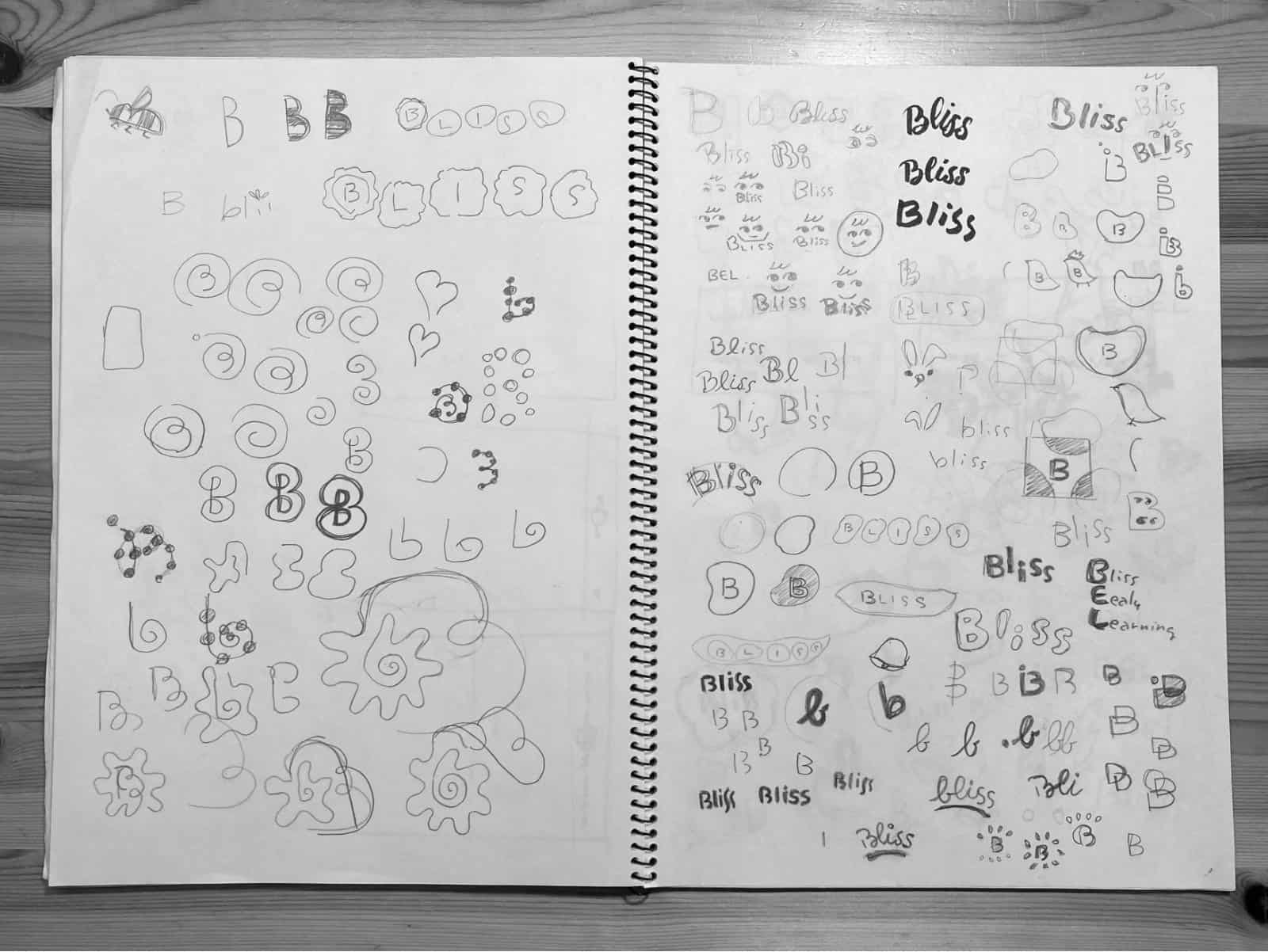
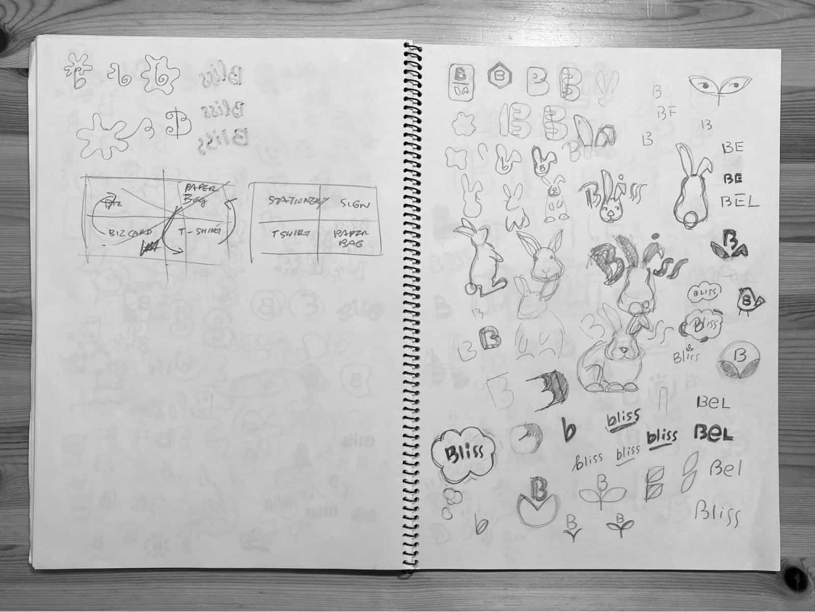
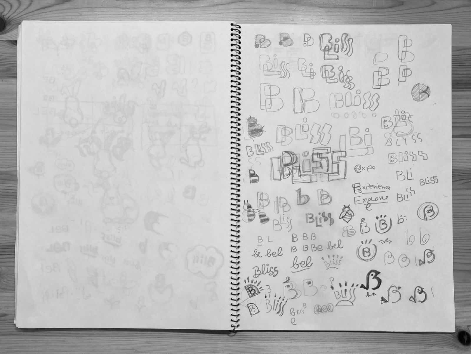
Early stage design exploration for the logo
The client felt all presented logos were unique, clean and modern. They narrowed it down to three choices: A, B and C, with minor adjustments and colour experiment requests.
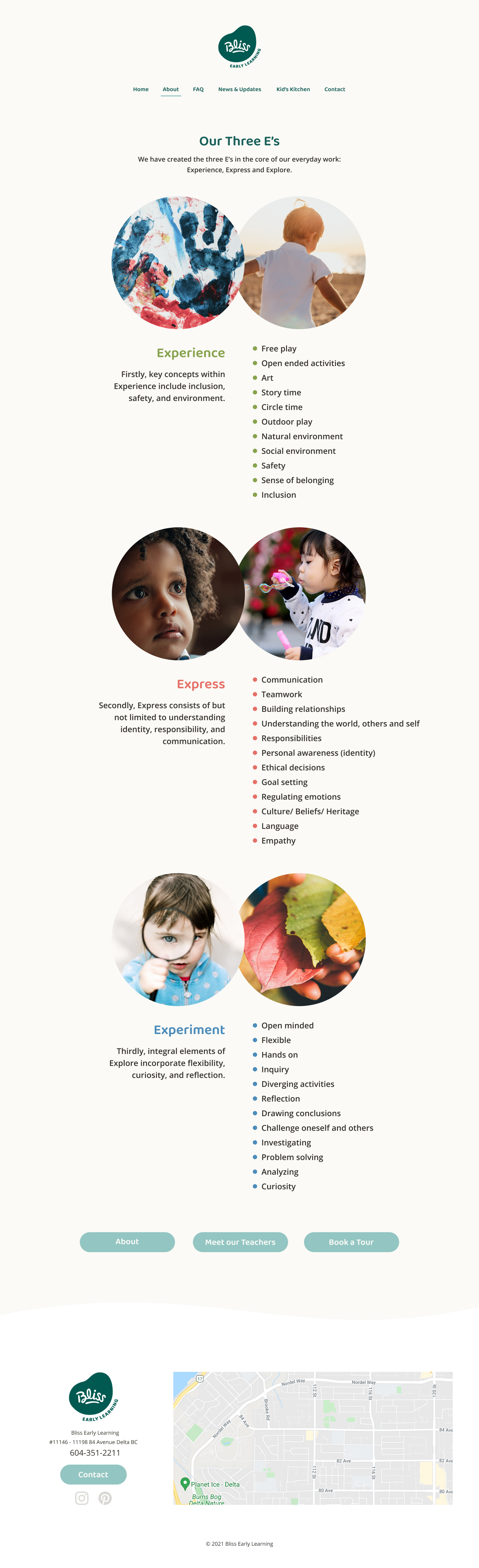
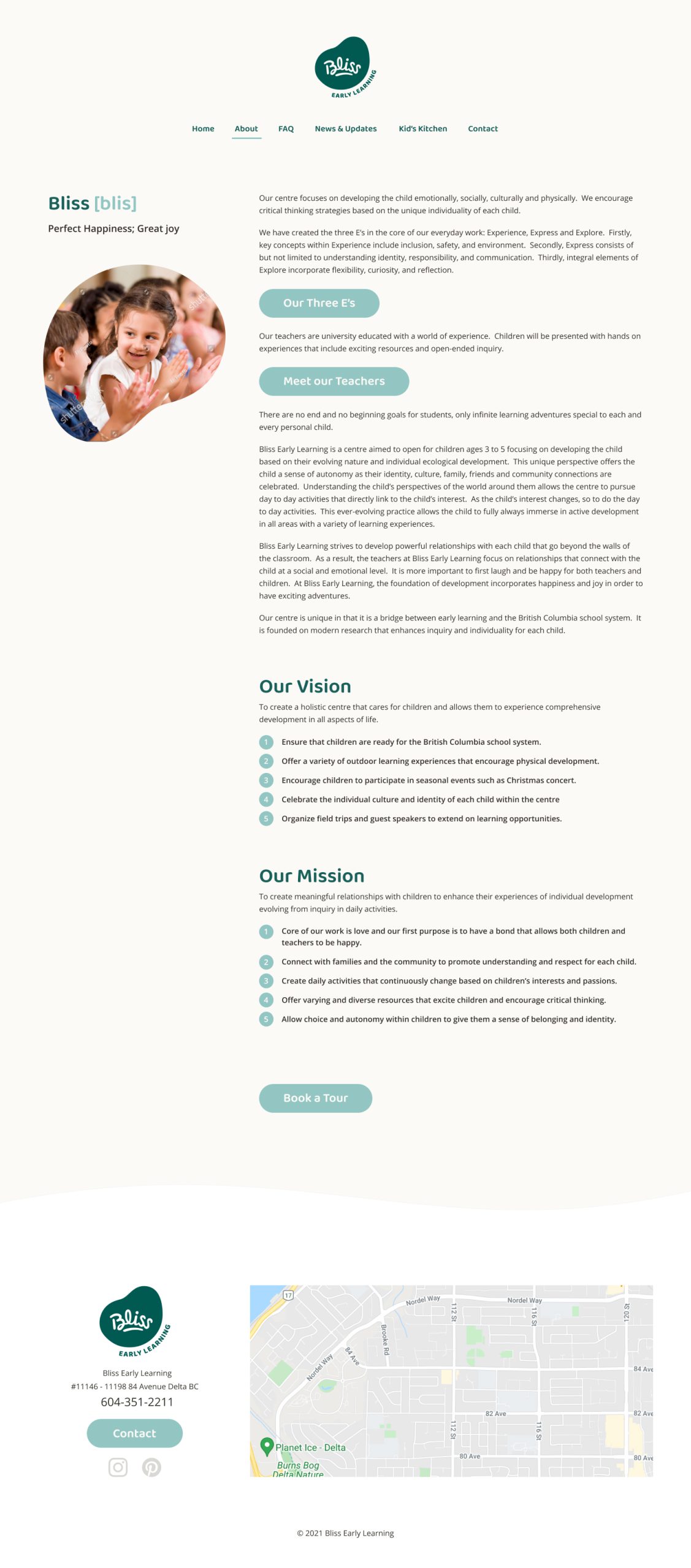
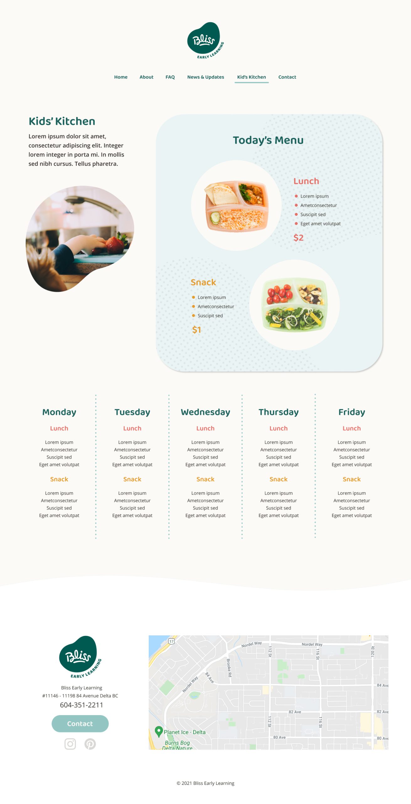
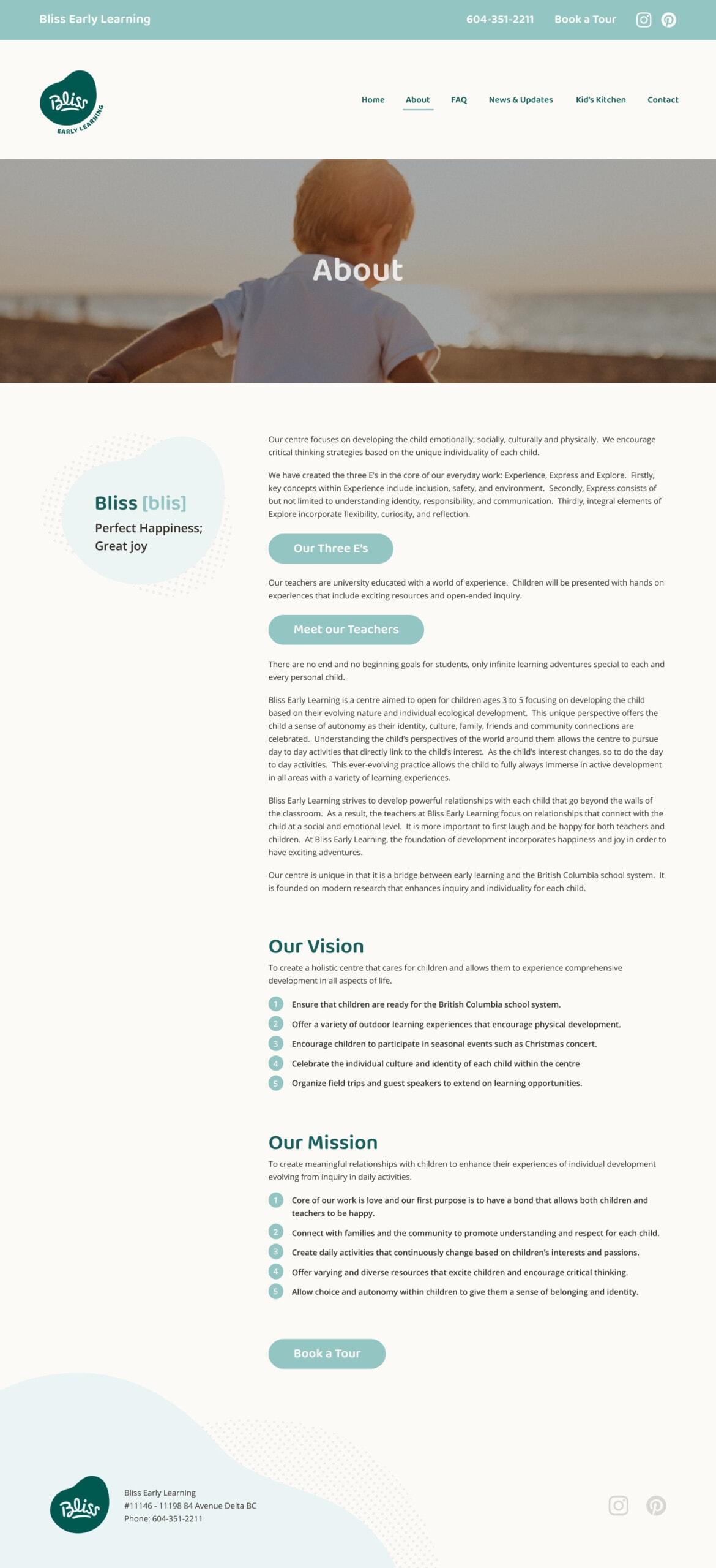
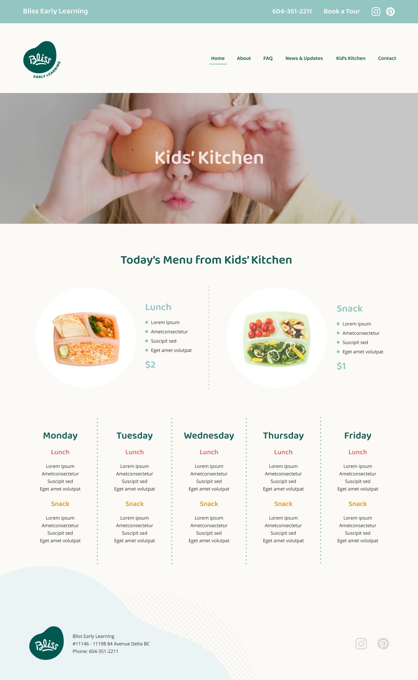
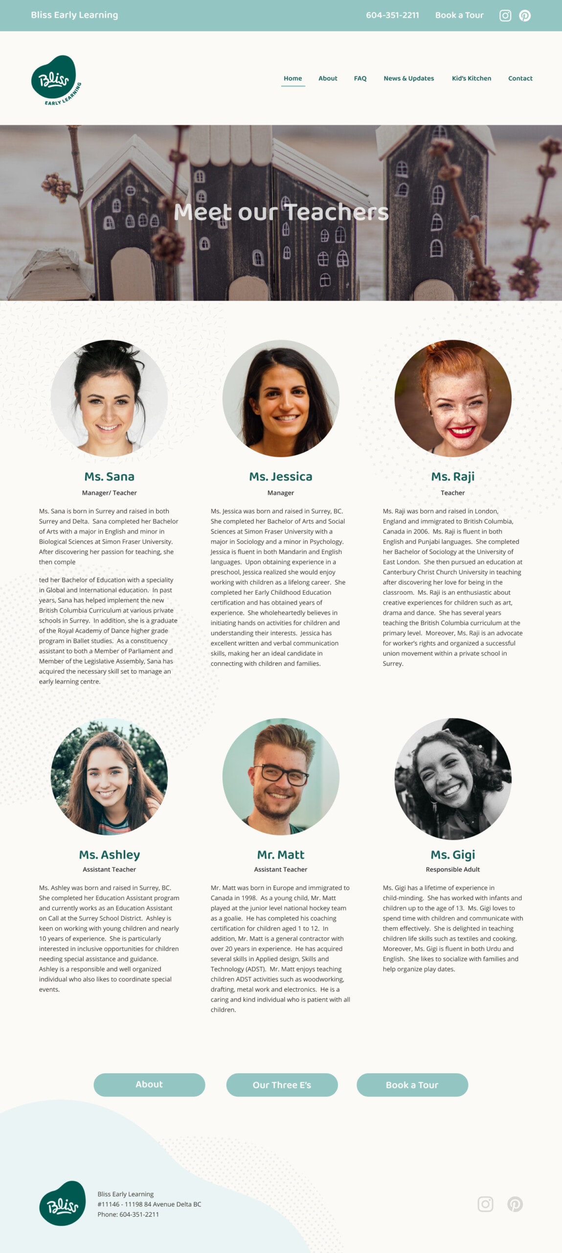
Once the logo was finalized, we moved on to web design, starting with creating a style tile. We created two designs that reflect the brand image the client was aiming for: organic, happy and modern. Visitors can easily understand the centre’s value. Easy to navigate. Open for future expansion for additional functions such as online payment.
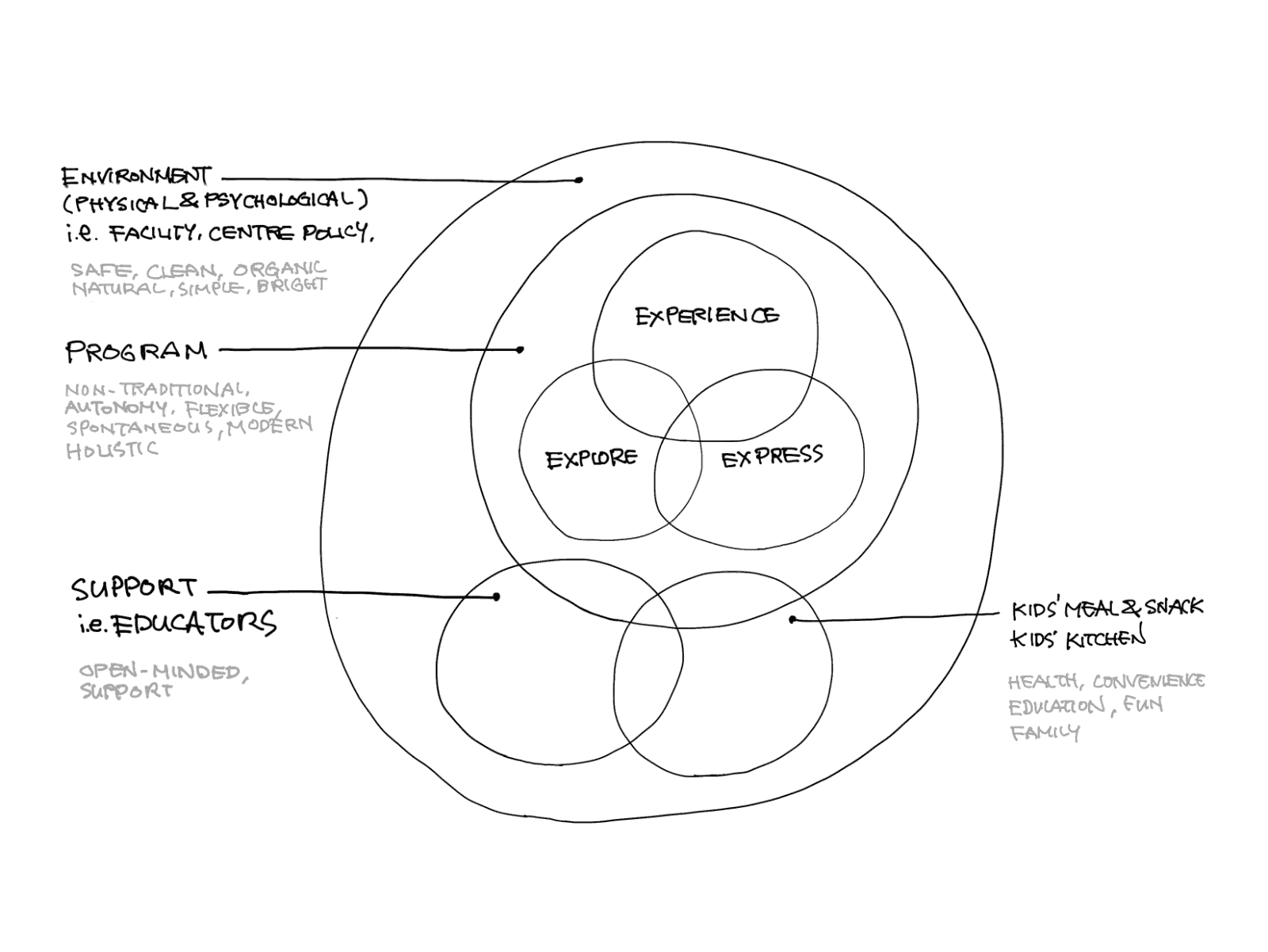
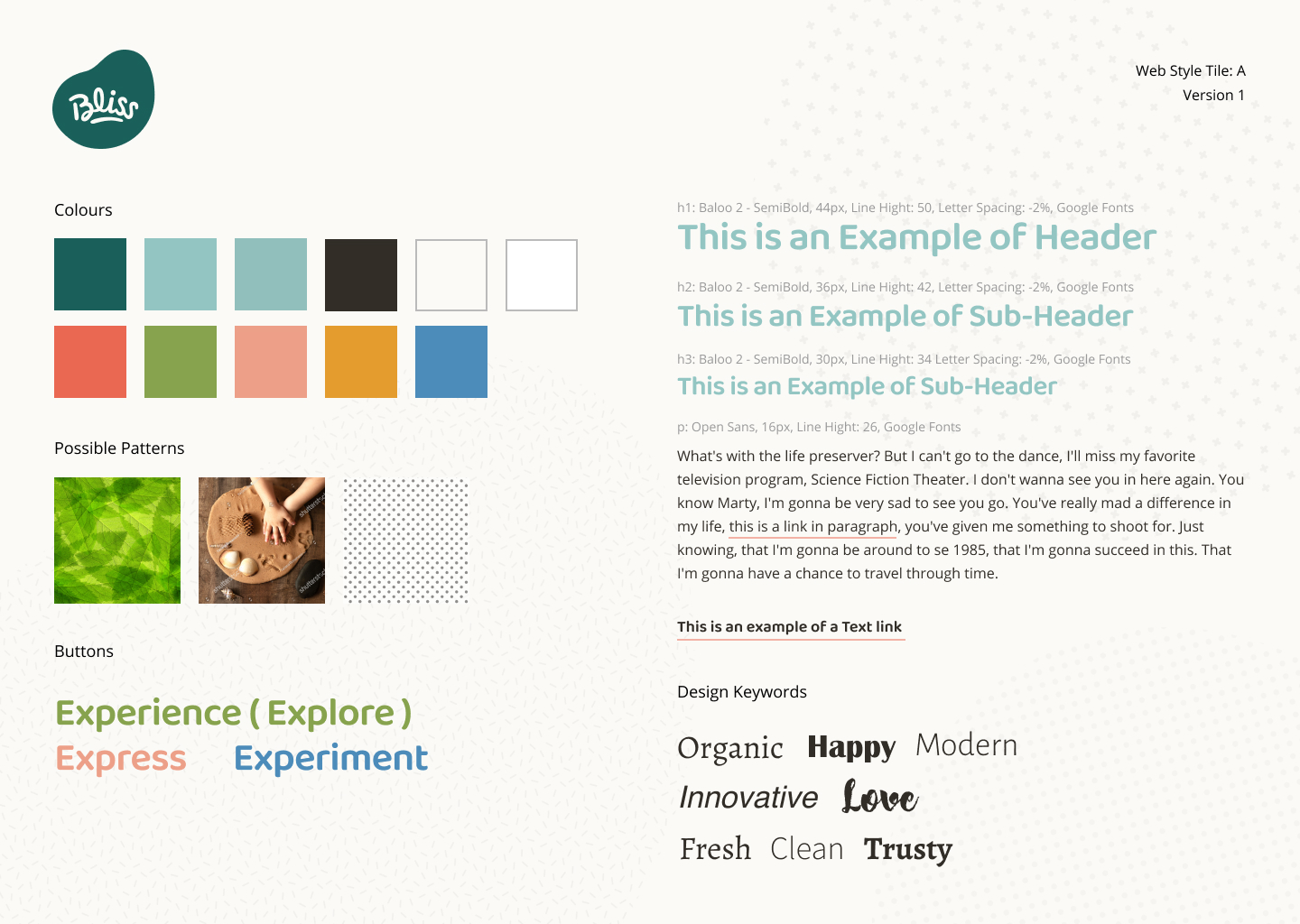
Concept diagram to understand how key concepts align with the center’s operation (left), Style tile for web design (right)
Although we completed the logo design and the design phase of the website, finding a physical location, hiring teachers and staff members, and getting building permission became very difficult for the client, largely due to COVID-19. The business opening was postponed indefinitely.
Applications & Tools
Adobe Illustrator, Affinity Designer, Artboard Studio, Figma
Bliss Early Learning Center Logo Design Analysis | DesignRush
Design A - Bouncy Seed (selected)
The bouncy seed or bean shape represents potential energy and an organic feel. The text at the bottom signifies that children can explore freely with the support of teachers.
Design B - Heart Monogram
The simple line art monogram, featuring a "B" and a heart shape, symbolizes love, happiness, and an airy feel.
Design C - Curious Bunny
The bunny, combined with the word "Bliss," symbolizes lively, playful, and curious children.
Design D - Creative Bubbles
This graphic symbolizes the curiosity and creativity of children, showcasing the infinite possibilities that arise from their imaginative minds.
Design E - Happy Kid
The smile represents happy children filled with curiosity and potential. The bouncy "Bliss" lettering symbolizes a fun and spontaneous atmosphere.
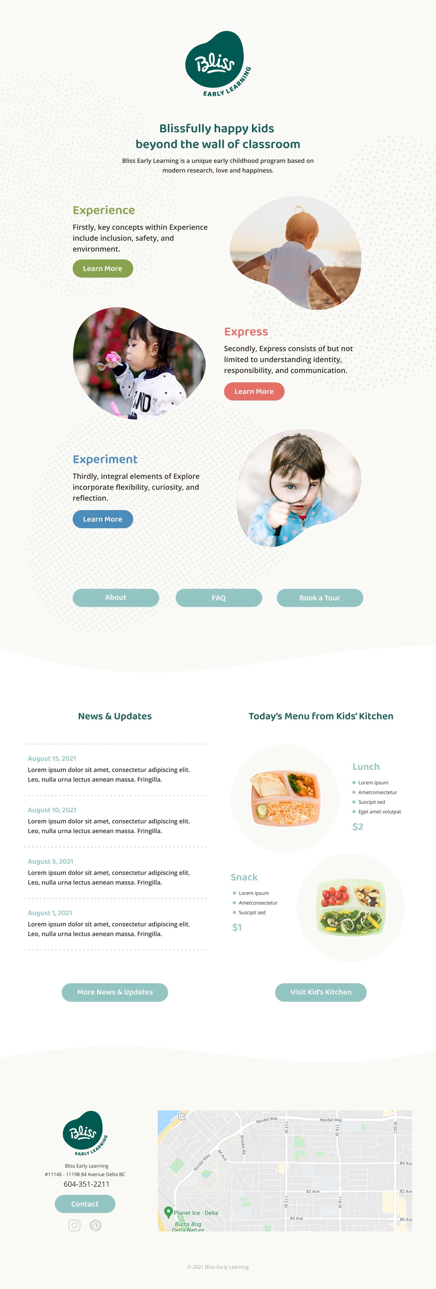
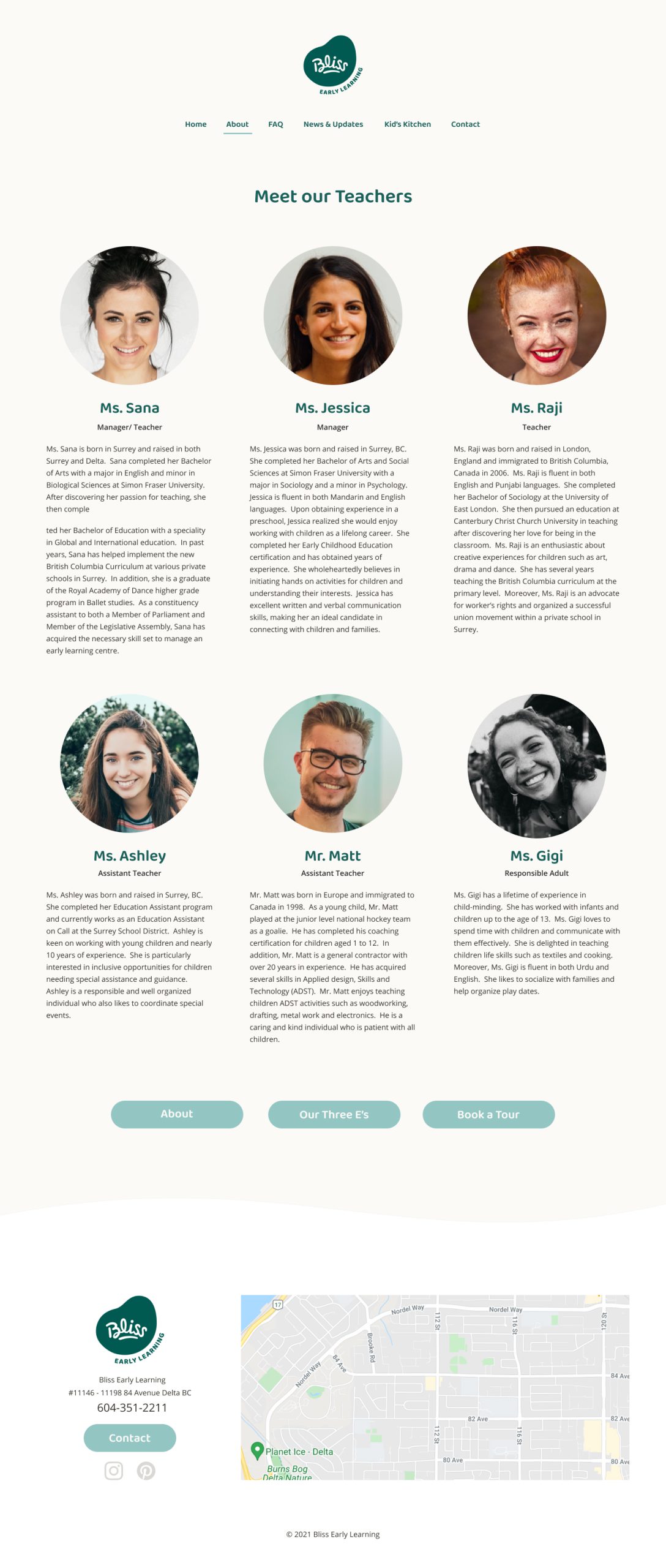
Web design presentation – A
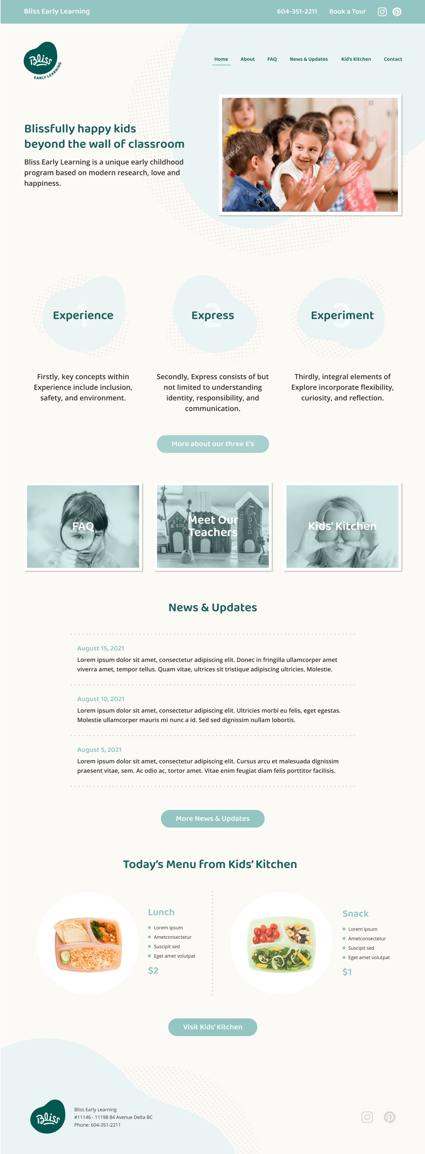
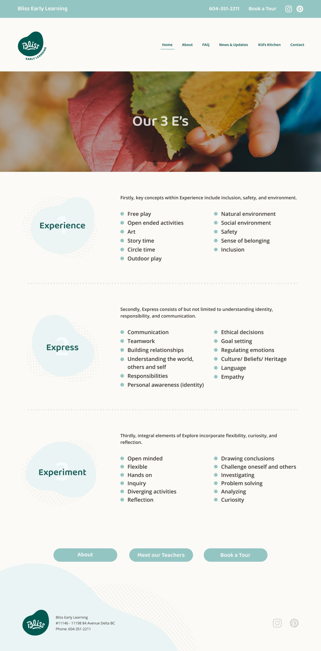
Web design presentation – B
IndexNow って何?
IndexNow は Microsoft Bing や Yandex などの検索エンジンがサポートしている仕組みで、ウェブサイトのコンテンツが更新されたことをすぐに検索エンジンに知らせることができます。
どんなメリットがあるの?
従来は、サイトマップを送信した後、検索エンジンは定期的にウェブサイトをスキャン(クロール)することで変更を検知していましたが、検索結果に更新が反映されるまでに遅延が生じることがよくありました。IndexNow を使用すると、サイトのコンテンツを追加、変更、または削除するたびに、自動的に直接検索エンジンに通知することができます。この方法により、不要なウェブサイトのクロールが減り、検索エンジンのリソース使用量も削減できるため、環境にも優しい仕組みです。
効果は?やってみる価値はある?
通知後されたURLをもとにクロールするかどうかの最終的な判断は、あくまでも Bing や Yandex などの検索エンジン側に委ねられているため、すべてのページが毎回確実にインデックスされる保証はありませんが、IndexNow を導入することで、毎回手動でサイトマップをアップロードすることなく、Bing や Yandex に常に最新の情報を通知することができます。
2025年5月14日時点では、残念ながら Google は IndexNow に対応していませんが、Google はこの機能を無視するだけなので、導入してもSEOに悪影響が出ることはありません。
SEOに興味があるのであれば設定する価値があります。逆に導入しない理由はほとんどありません。私どもの実装では、通知送信ログをモニターすることもできます。
もっと知りたい...
What is it?
It's a protocol supported by search engines like Microsoft Bing and Yandex that instantly notifies them when website content changes.
What's the benefit?
Traditionally, when you submit a sitemap, search engines find out about changes to your website by scanning (crawling) it periodically. This can often lead to delays in updates from appearing in search results. With IndexNow, you can directly inform search engines whenever you add, change, or remove content on your site. This method helps reduce unnecessary website crawling and lowers the resources used by search engines, making it better for the environment.
How effective is it? Is it worth doing it?
Although search engines like Bing and Yandex ultimately decide which pages to crawl based on IndexNow notifications, this tool makes it much easier to keep search engines updated about your content changes without manually uploading sitemaps every time.
As of May 14, 2025, Google does not support IndexNow, unfortunately, but since Google simply ignores this feature, implementing it won't have any negative impact on your SEO.
If you're interested in SEO, it's worth setting up—there's little reason not to. Our implementation lets you monitor the notification submission logs.
Dig more...
Goals & Challenges
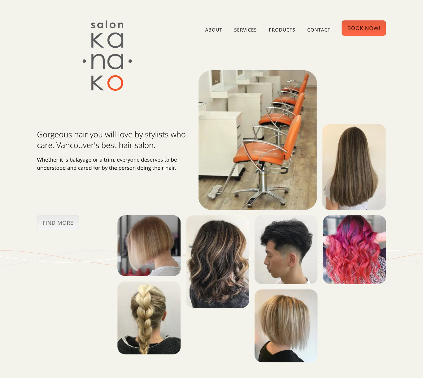
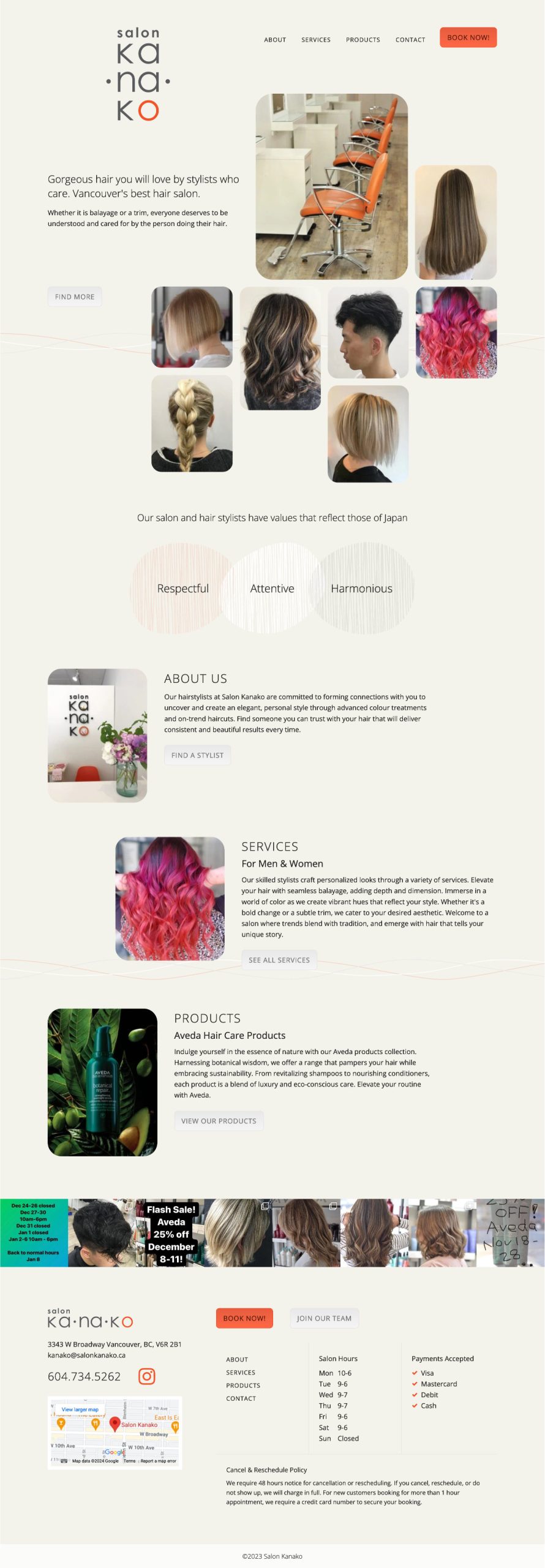
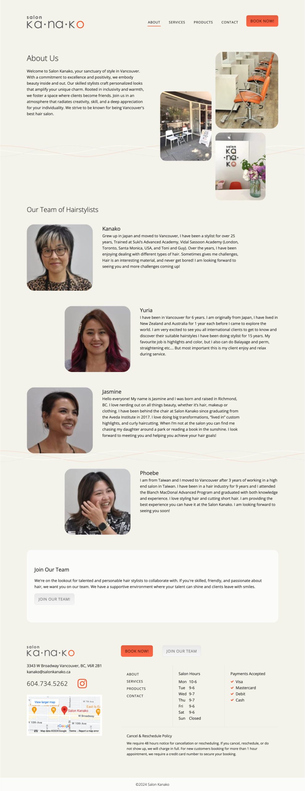
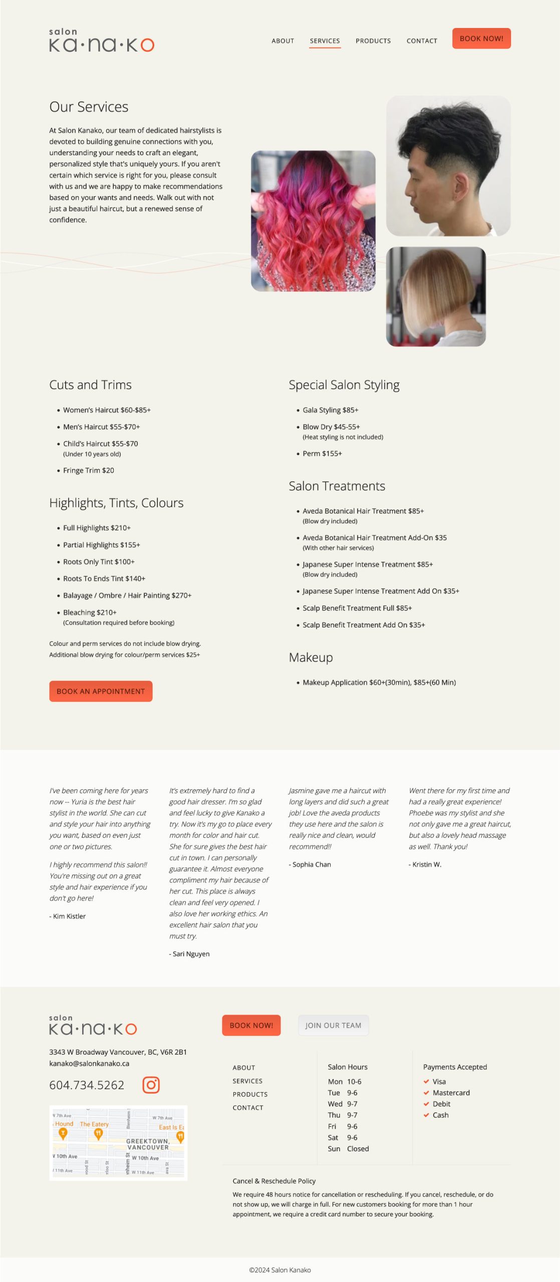
A hair salon located in Vancouver was looking to revamp its website, which was created over 10 years ago. They felt that it needed a fresh look, and some of the content on the website was too lengthy or no longer relevant. The client was also seeking assistance with content writing and advice on online marketing strategies.
The goal was to redesign the website to reflect the salon’s concept and ambiance with a better user experience: better usability, simpler and logical content structure and better site performance. It was also necessary to retain the third-party booking feature.
Resources & Materials
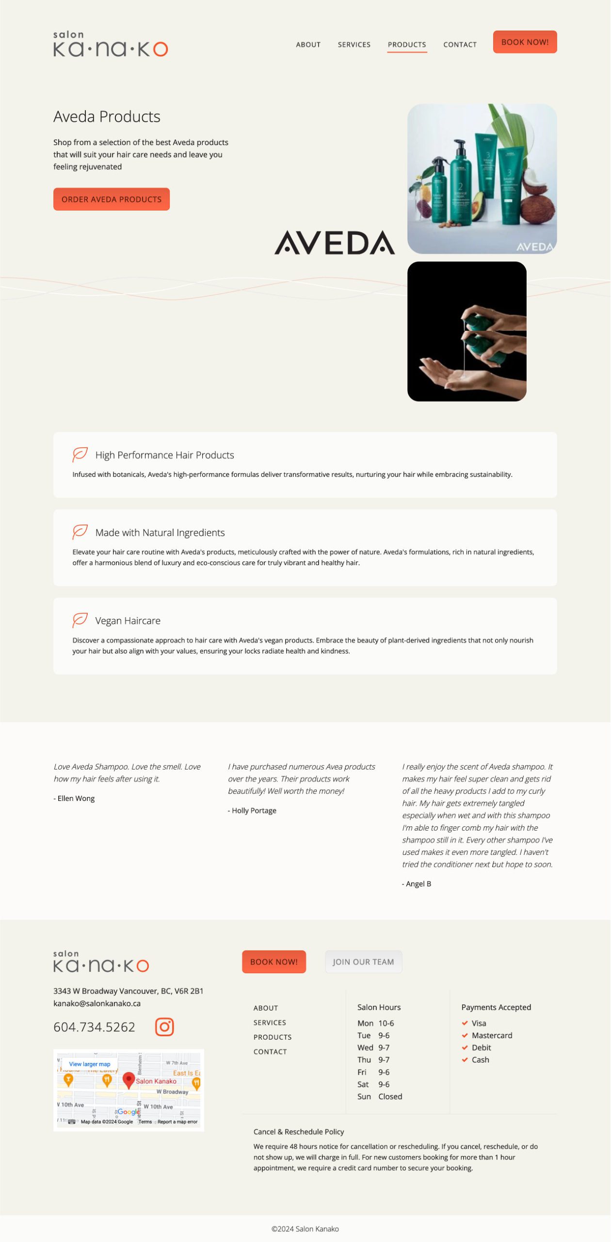
The client contributed updated photographs of the salon and team members. Additionally, we had access to a few images from their product vendor.
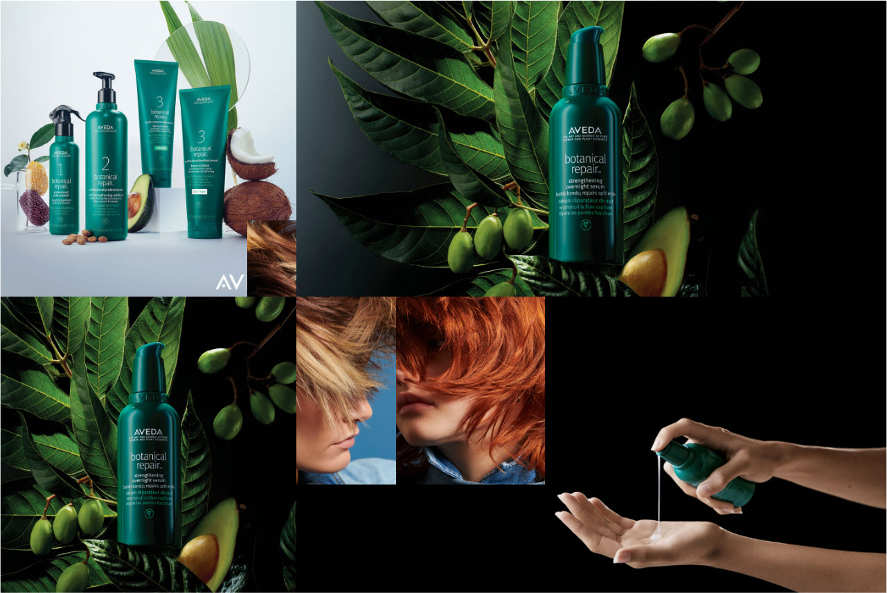
Product image materials
Approach & Outcome
To support our client with content writing and offer guidance on online marketing strategies, we provided insights on how we, as a web design and development team, can collaborate with a content writer and online marketing specialist. We also presented various options for outsourcing content writing and online marketing strategies tailored to their budget and priorities.
Website structure plan
We teamed up with Bandcamp Digital, planning content restructuring and user-focused design. While Bandcamp Digital focused on copywriting and provided advice on online marketing, we worked on design, development, and on-page optimization. Additionally, we acted as project managers, overseeing the seamless execution of the entire project.
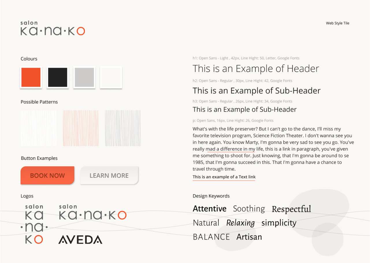
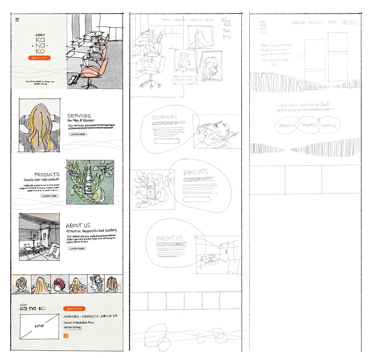
Website style tile (left) and early stage sketches (right)
Applications & Tools
Adobe Illustrator, Adobe Photoshop, Affinity Photo, Figma, WordPress
Goals & Challenges
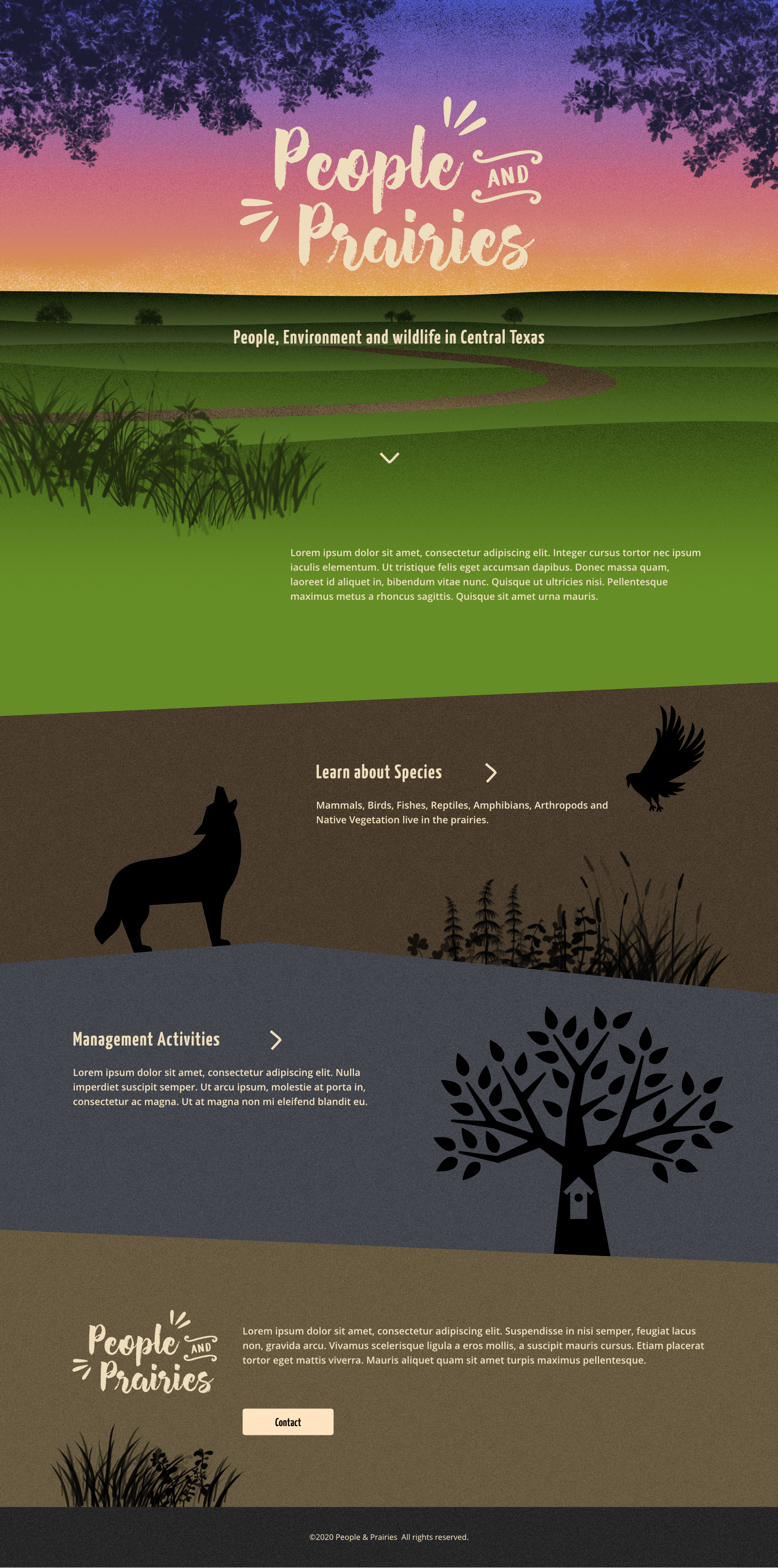
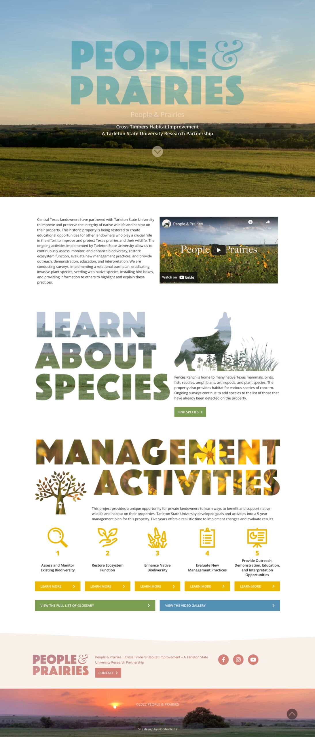
The clients were landowners from Central Texas who had partnered with Tarleton State University. They were seeking an online platform to facilitate communication and provide resources for landowners and residents in the area, offering a unique opportunity to learn how to support and benefit native wildlife and habitats on their properties.
Additionally, the website will serve to present the goals, activities, and progress of the land management efforts by Tarleton State University.
Collecting content materials, such as management plan details (31 practices across 19 activities under 5 goals), species information (125 species categorized into 9 subcategories under 15 main categories), and additional photos showcasing nature and fieldwork, required strong organizational skills and patience.
Resources & Materials
We had several video calls and numerous email exchanges with the client and a coordinator, who was a graduate student. In addition to discussing the project's background and purpose, we reviewed specific details regarding the species and the management plan, including how the client wanted to present them and where to find external resources.
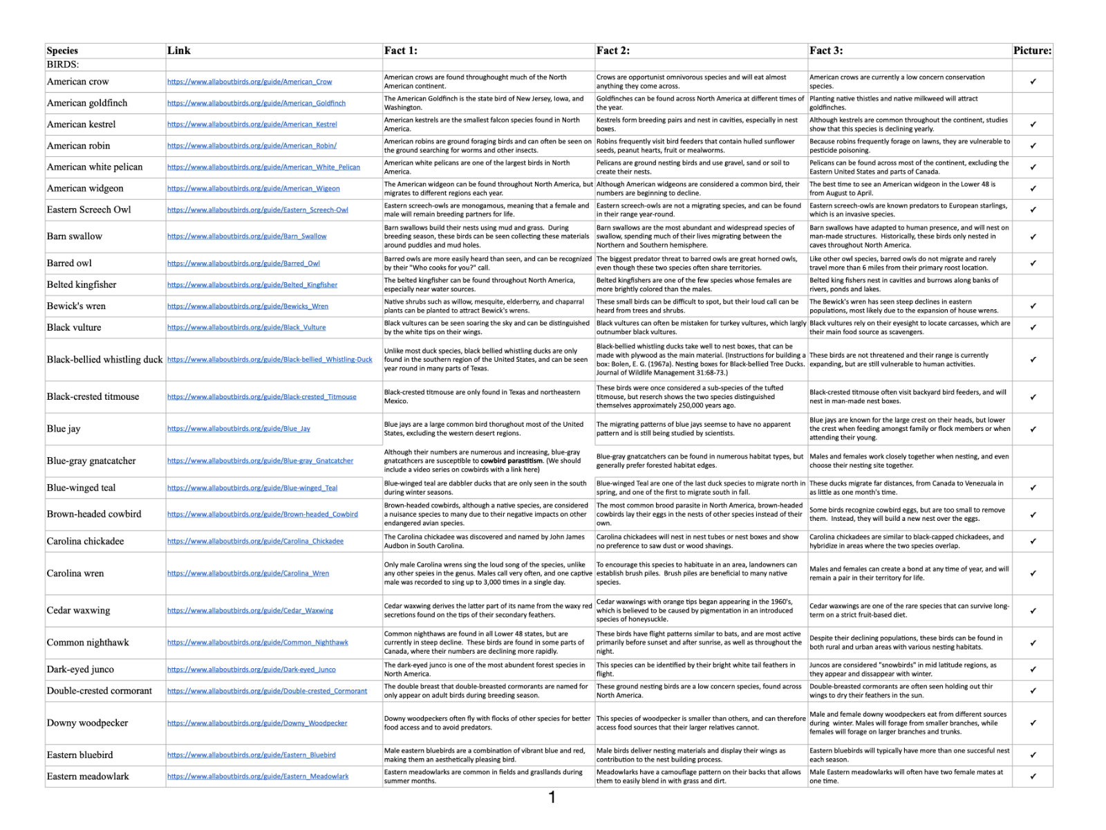
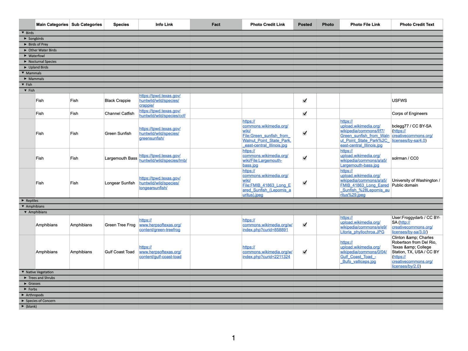
Species study database
While part of the management plan was still under review and expected to undergo some changes, we successfully gathered the key details with the coordinator’s assistance and were able to begin working without delay.
Approach & Outcome
We worked closely with the client to help them focus on gathering materials on schedule.
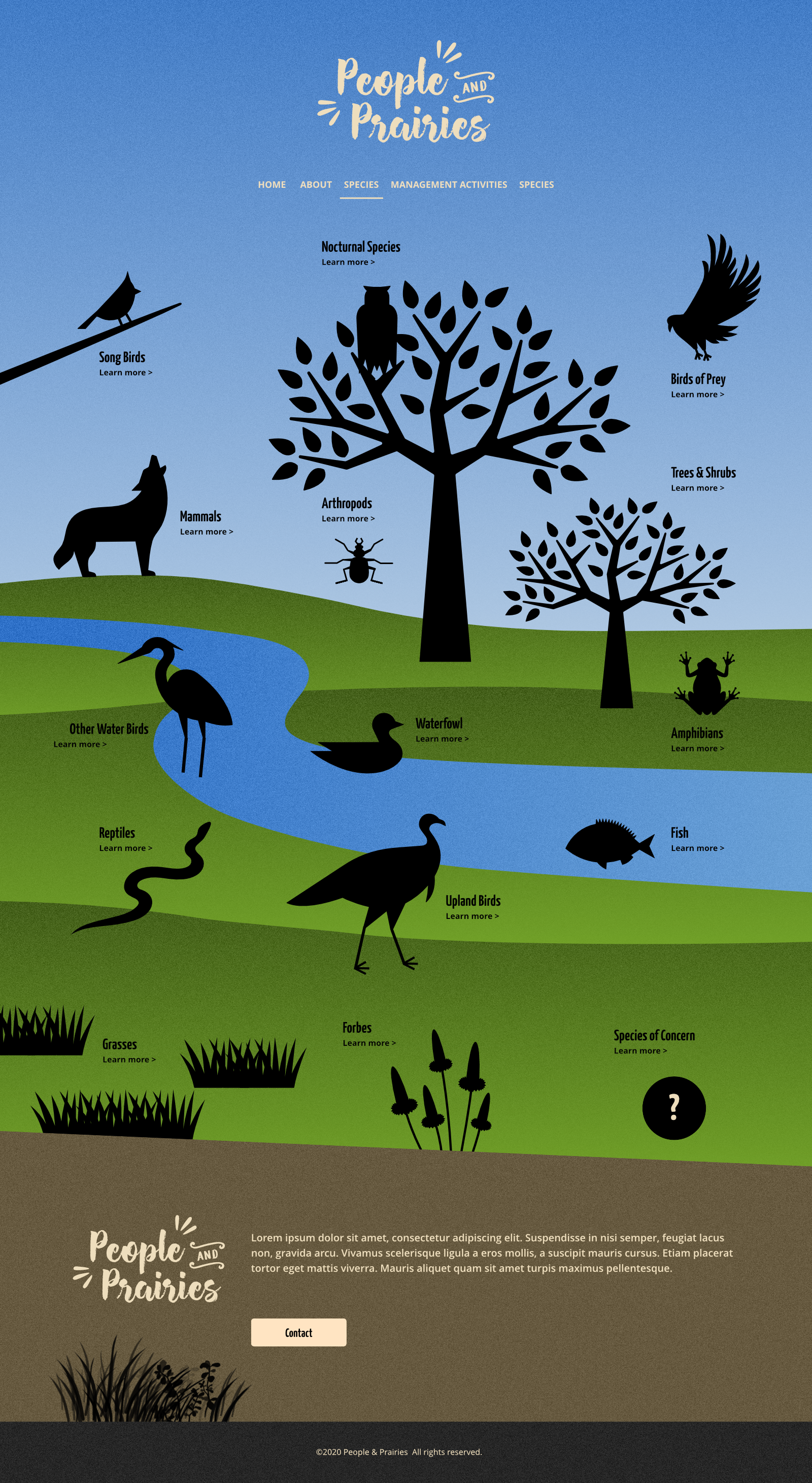
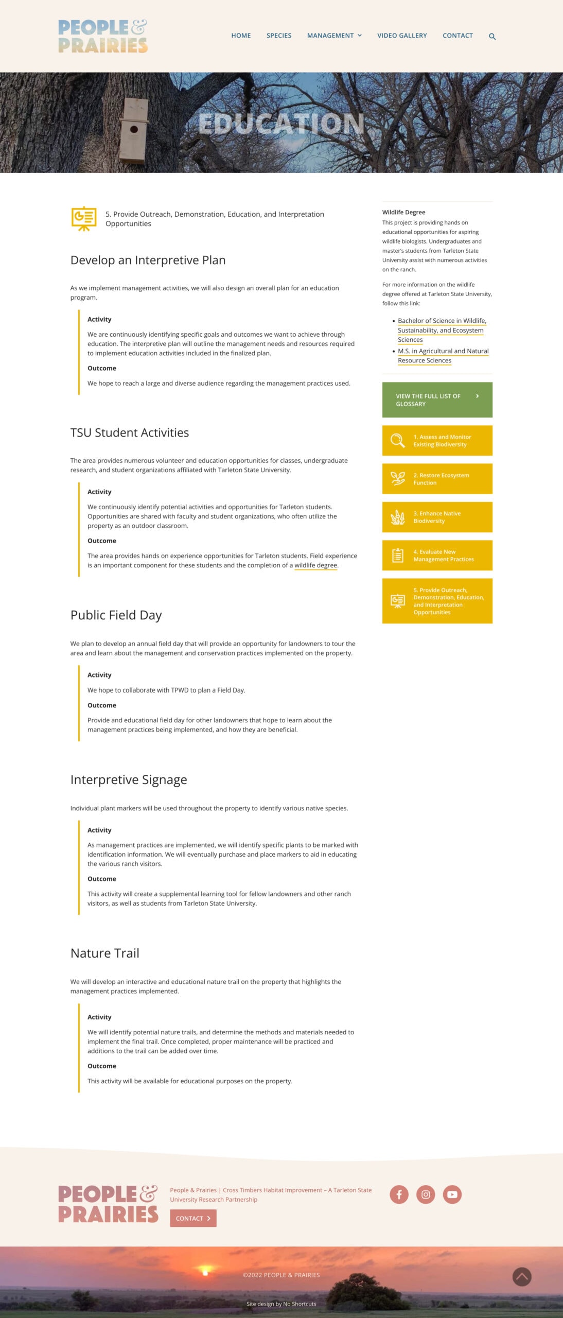
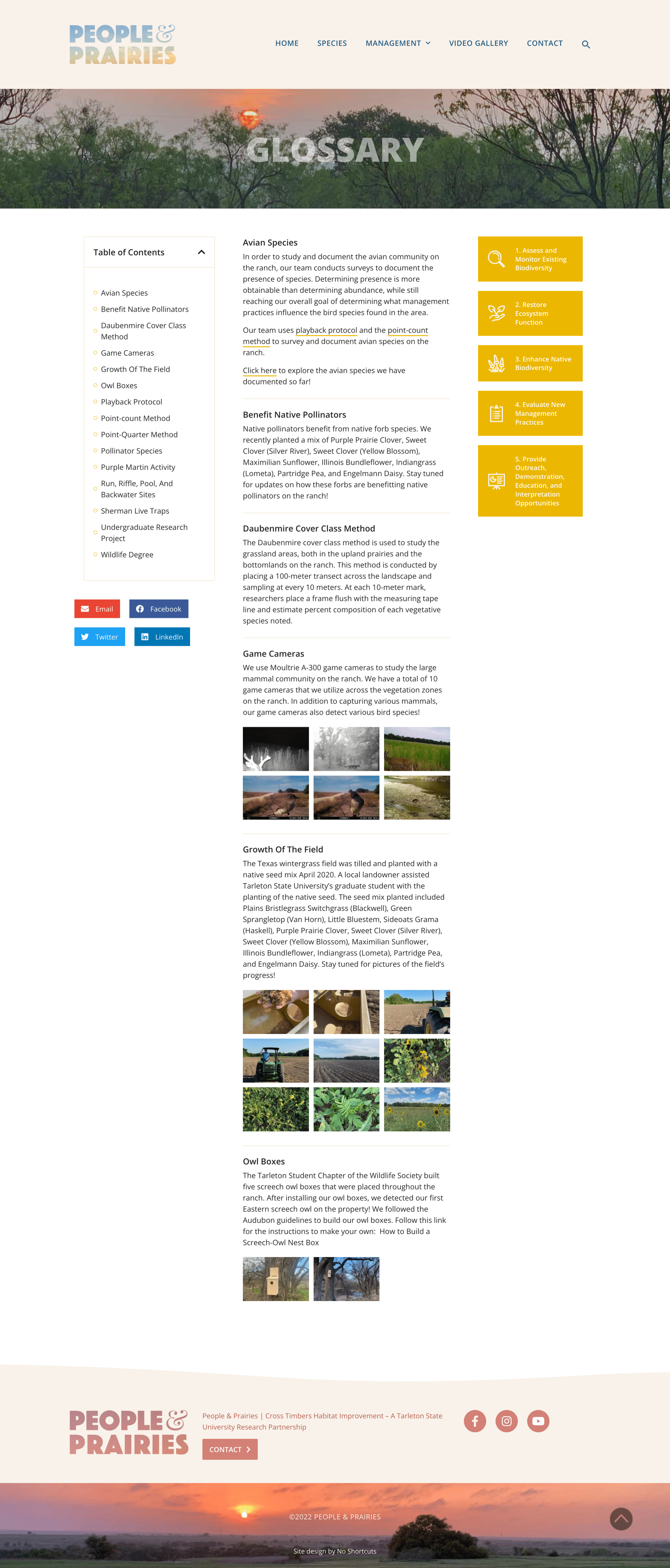
We restructured and organized the materials to prepare them for the website and carefully planned the site structure, ensuring that each piece of content had a clear purpose. A key feature of our work was creating pages that outlined the management plan in five steps. We designed icons for each step to help viewers easily understand the process, and we included a glossary on the side of each page to assist viewers in finding further information or definitions of unfamiliar terms.
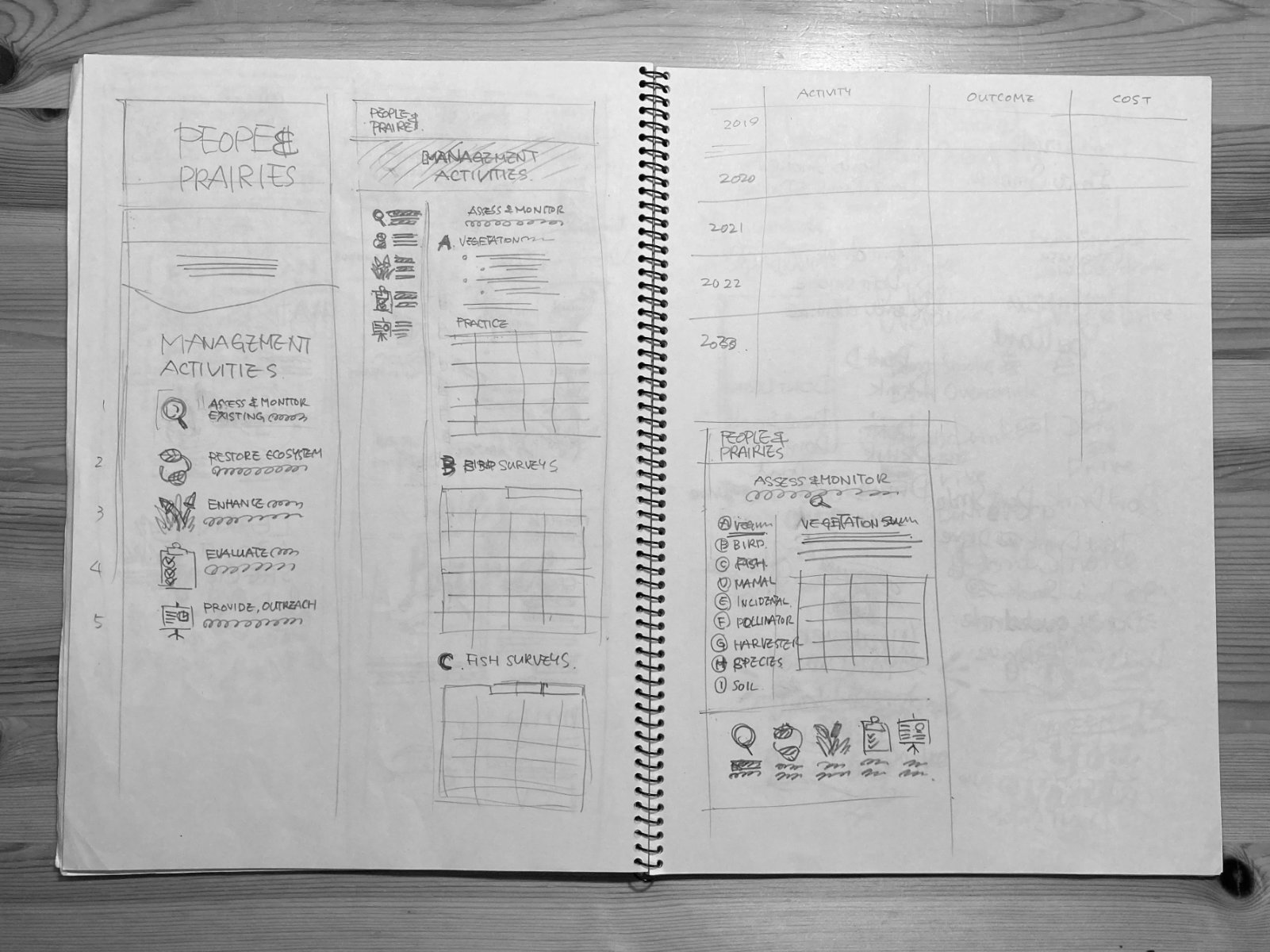
Early stage sketches
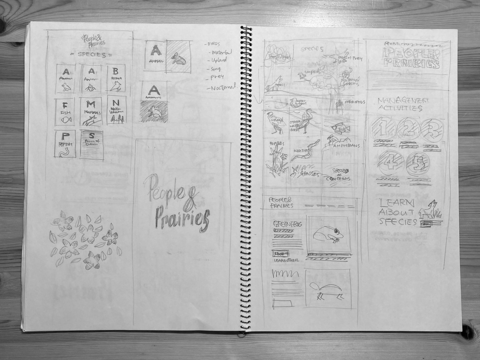
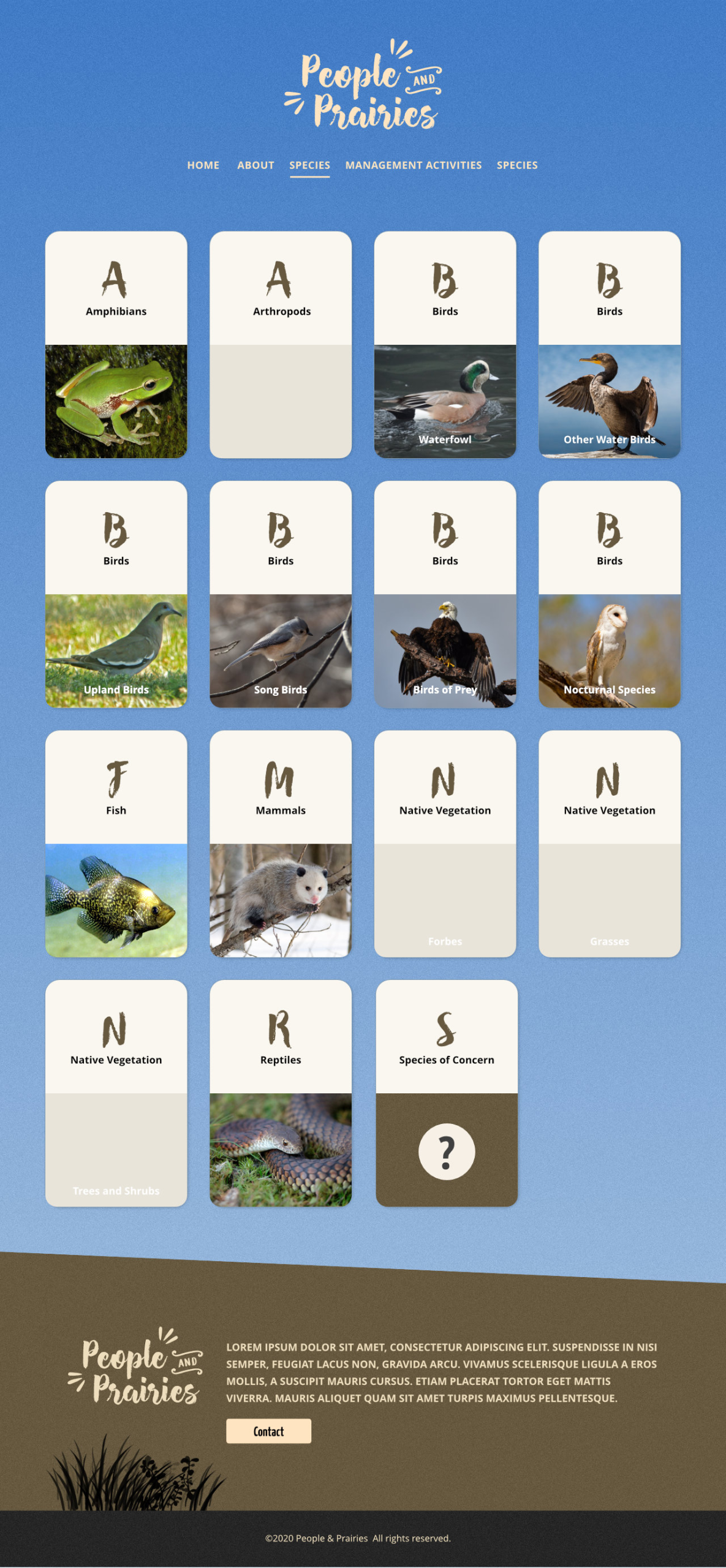
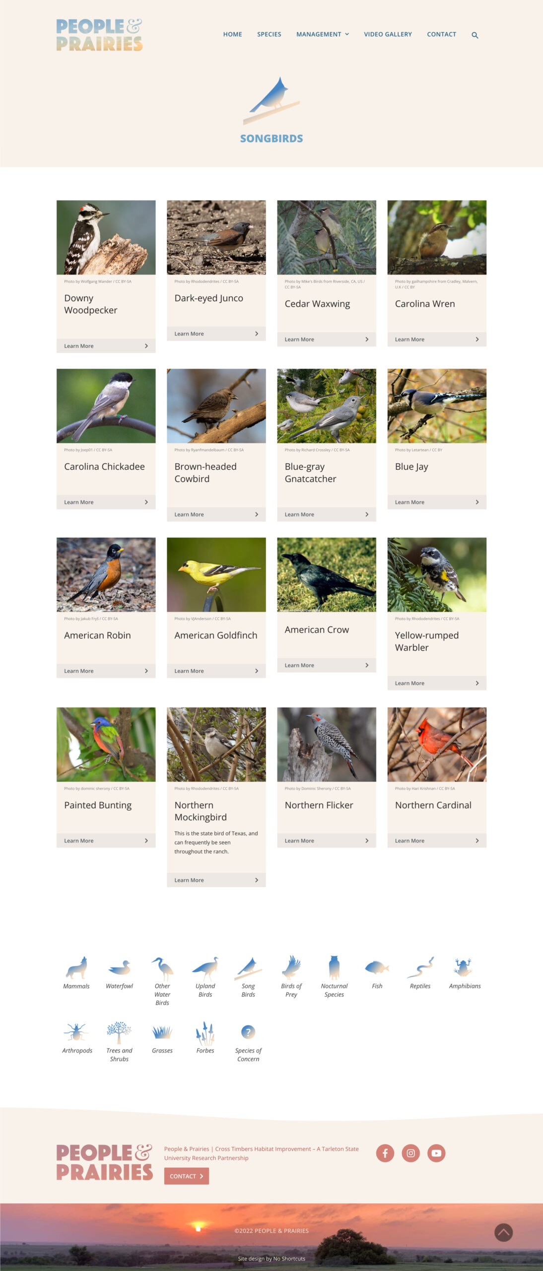
Another key feature was the species catalogue. We designed it with easily recognizable category icons, which facilitate navigation and make the site enjoyable to explore. We also assisted in finding species images from Creative Commons.
Other presented designs
We made a conscious effort to use photos of the land taken by the client whenever possible. These images perfectly align with the project's purpose and convey a sense of love for the beautiful land throughout the website.
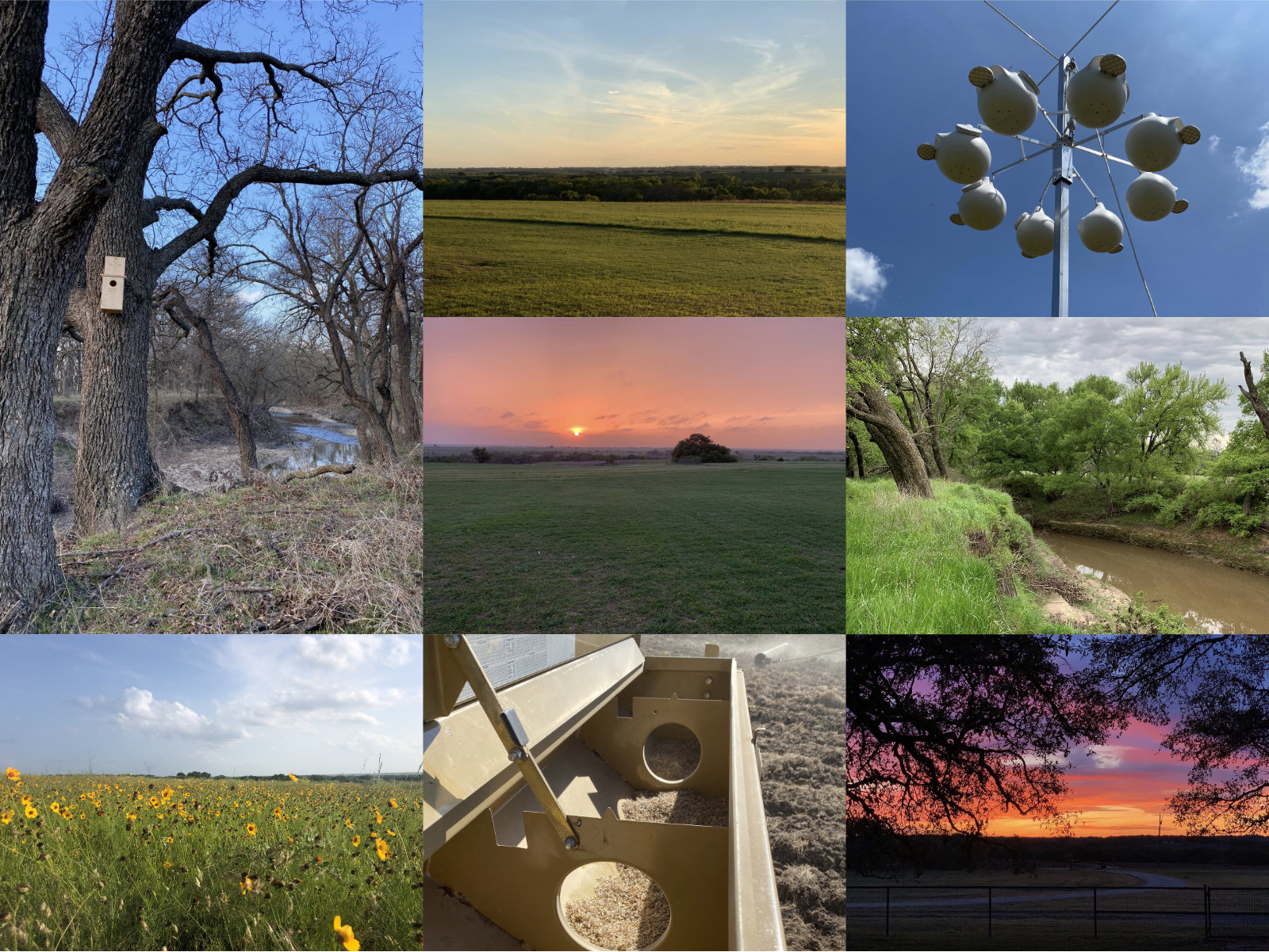
Inspiring photos taken by client
Applications & Tools
Adobe Illustrator, Adobe Photoshop, Affinity Designer, Figma, WordPress
The website is no longer active as this research project has been closed, but you can see the website sample here.
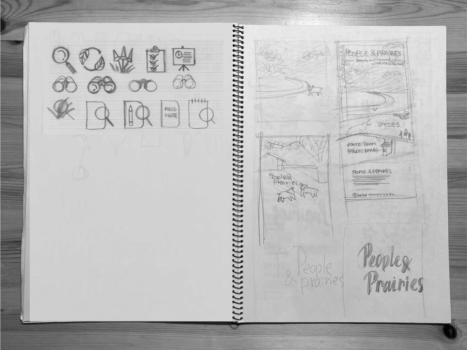
Icons created for the website
Goals & Challenges
The client was organizing an online event called the Bootstrap West Online Summit, a one-day micro-conference designed for independent software developers, makers, and solopreneurs in Western Canada and the USA. The organization’s core mission was to help bootstrappers develop healthy lifestyles and sustainable businesses.
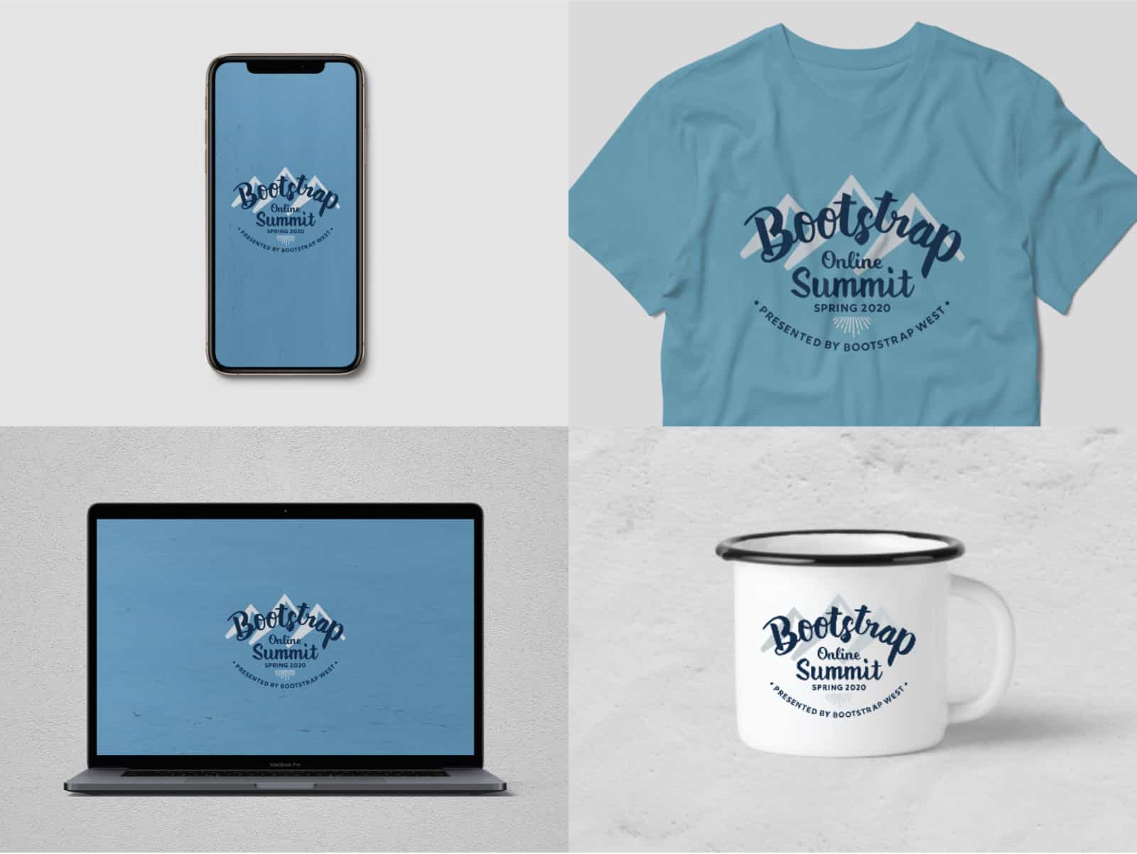
The client requested a logo that incorporates one or two colors and can be easily printed on fabric while staying within budget.
Resources & Materials
From a style perspective, the client liked the logo we previously designed for WordCamp Vancouver.
Approach & Outcome
We developed three design concepts. The client liked all of them, but he preferred design A the most. He viewed it as the most versatile and felt it captured the essence he wanted.
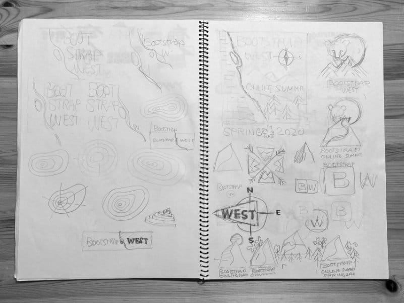
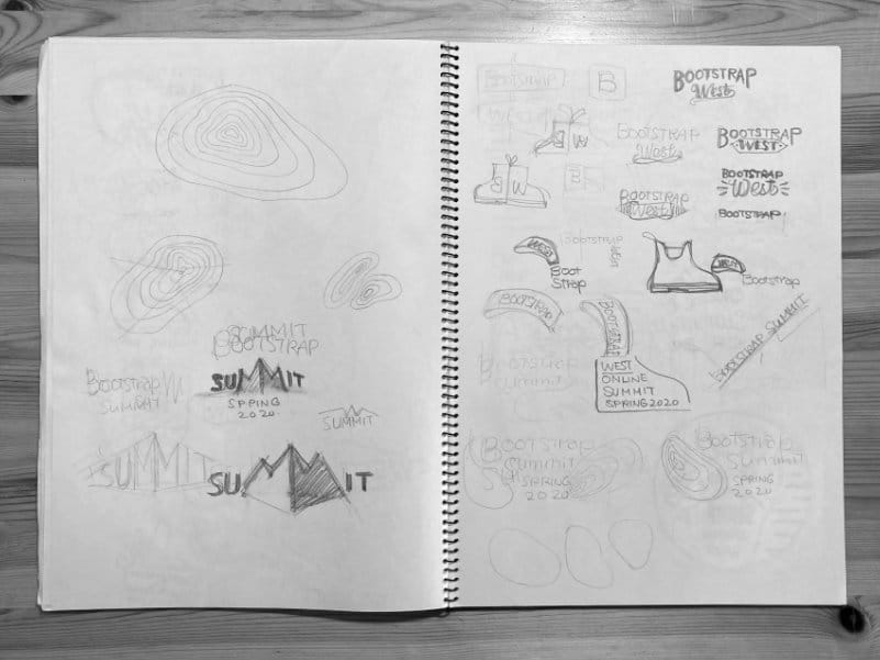
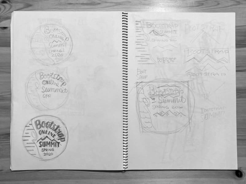
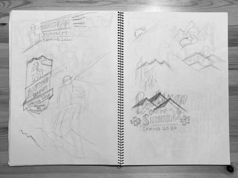
Early stage sketches
Applications & Tools
Adobe Illustrator, Artboard Studio
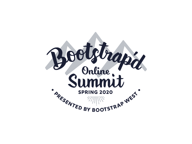
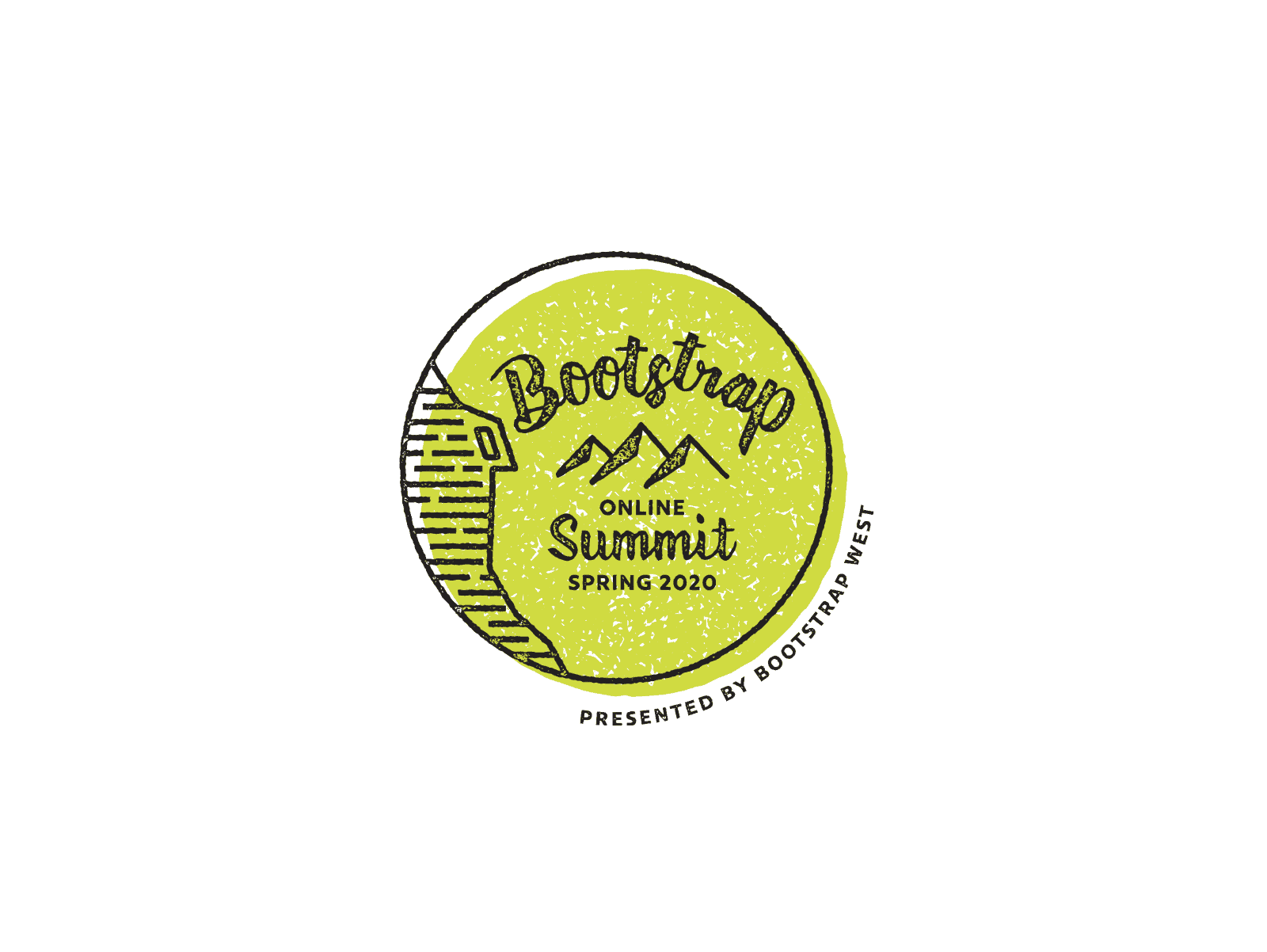
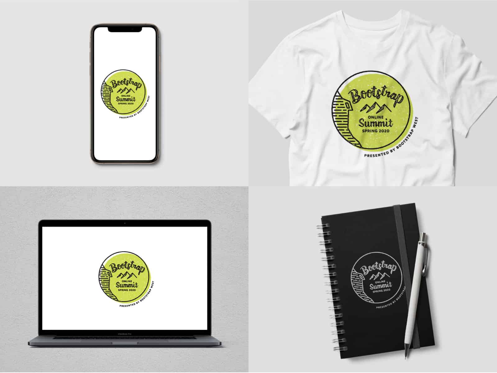
Design A (selected)
Inspired by the summit of a mountain, strong hand lettering represents the robust Bootstrap community and healthy lifestyles.
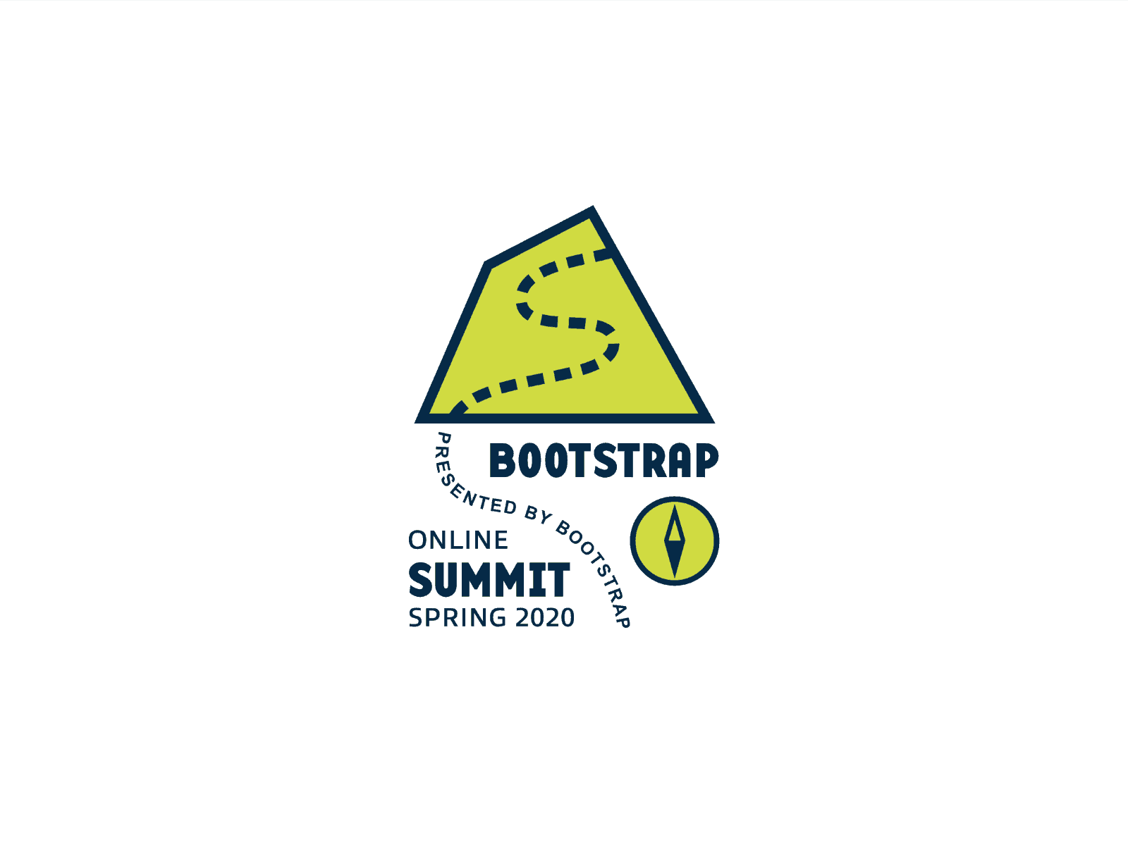
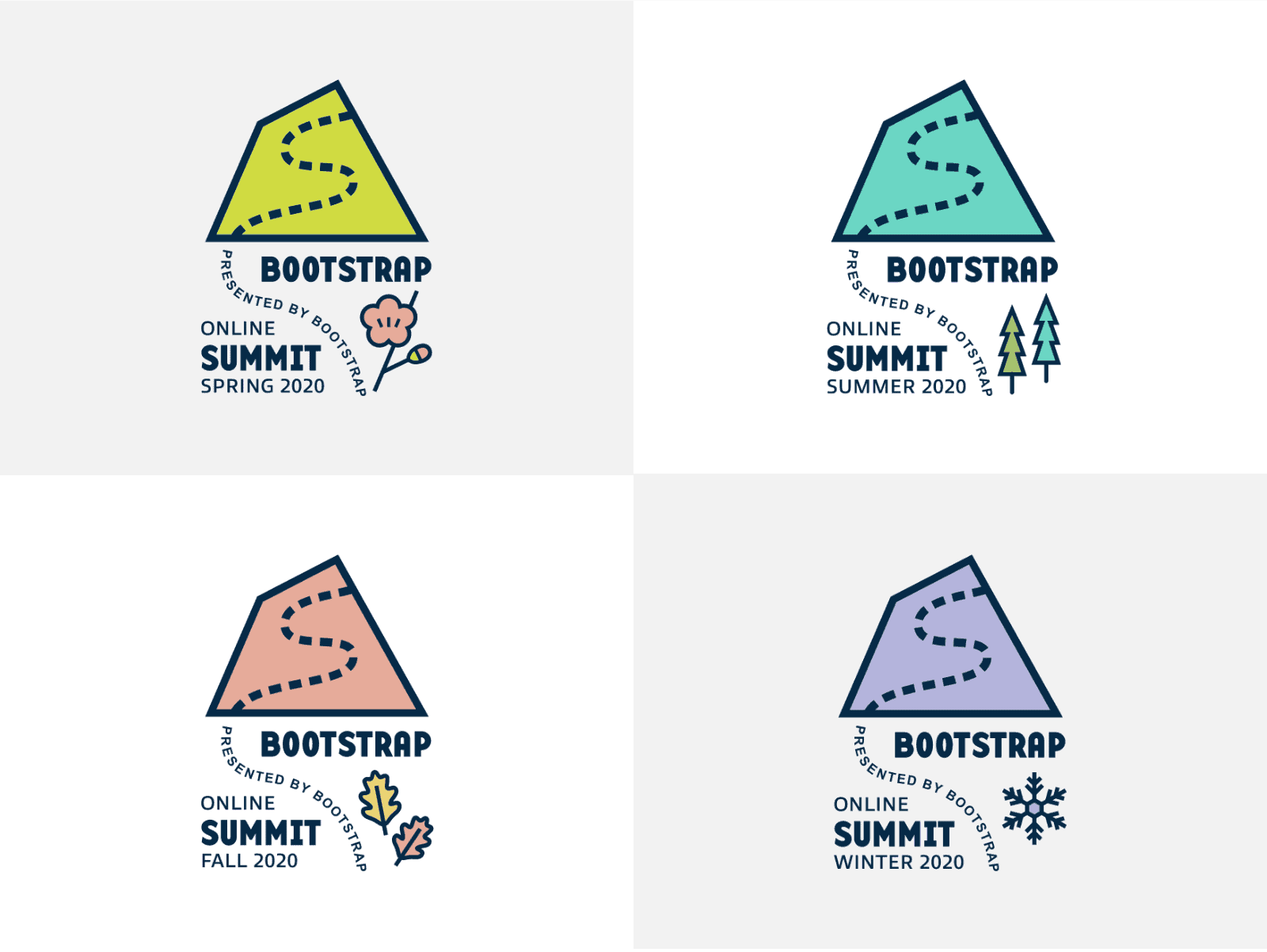
Other Presented Design - B
Expressing the footsteps climbing up to the summit in a fun way. Since the event might take place quarterly, the design could incorporate seasonal variations.
Other Presented Design – C
Adopting a similar style to the stamp effects from the WordCamp Vancouver logo that the client liked.
Goals & Challenges
The Binaytara Foundation is a non-profit organization dedicated to bringing positive changes to people’s lives by promoting health and education. The foundation is focused on advancing healthcare in resource-poor communities and enhancing cancer care worldwide by educating healthcare providers and the broader community.
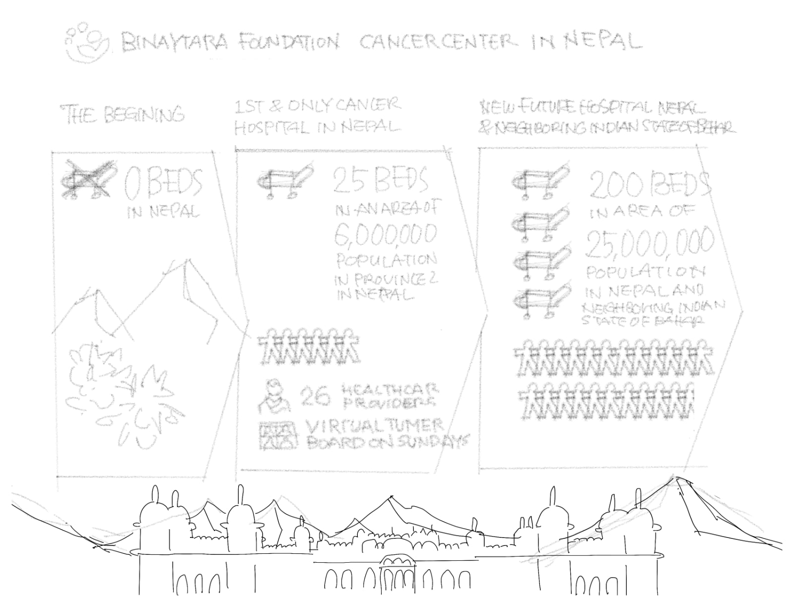
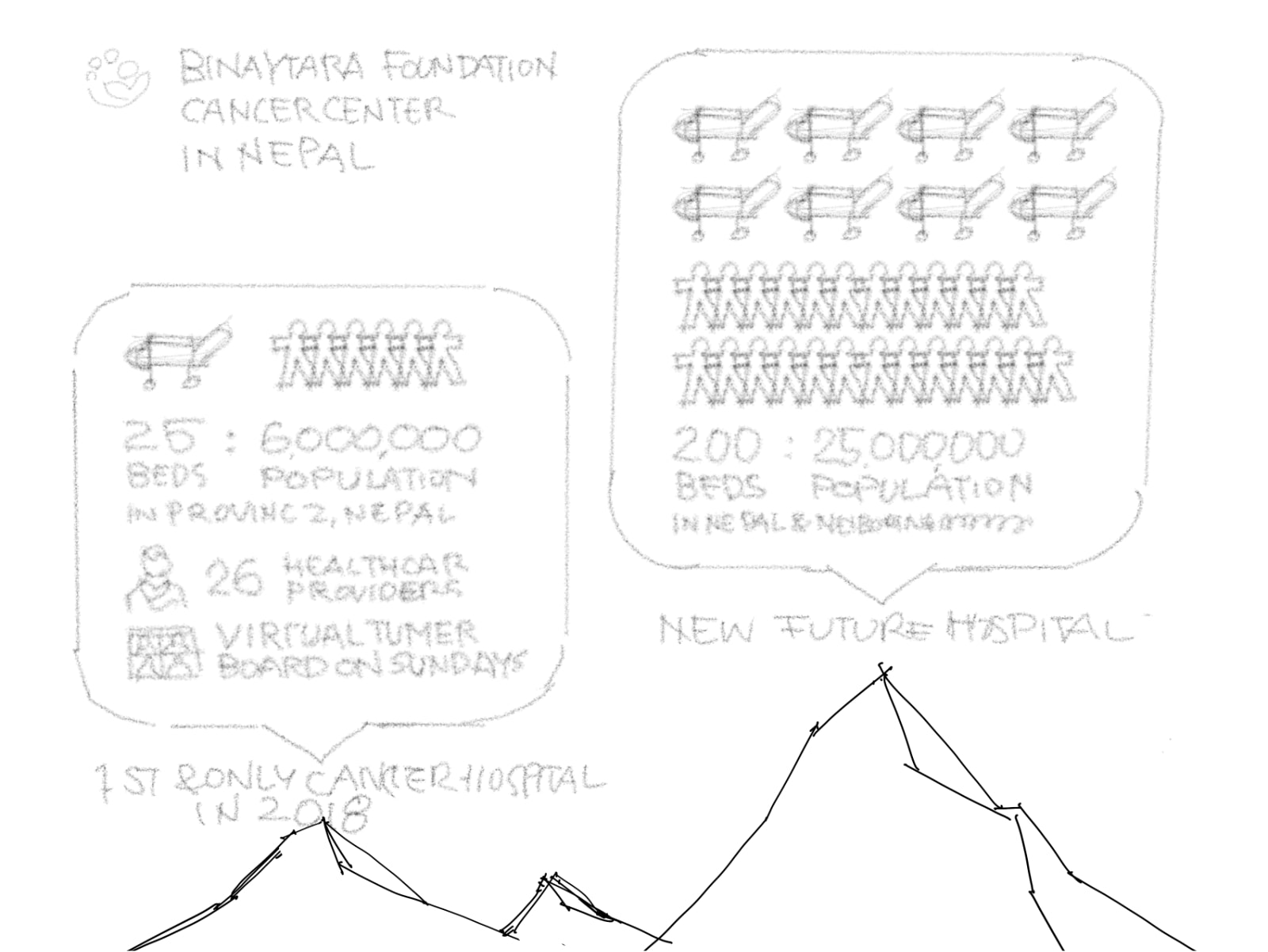
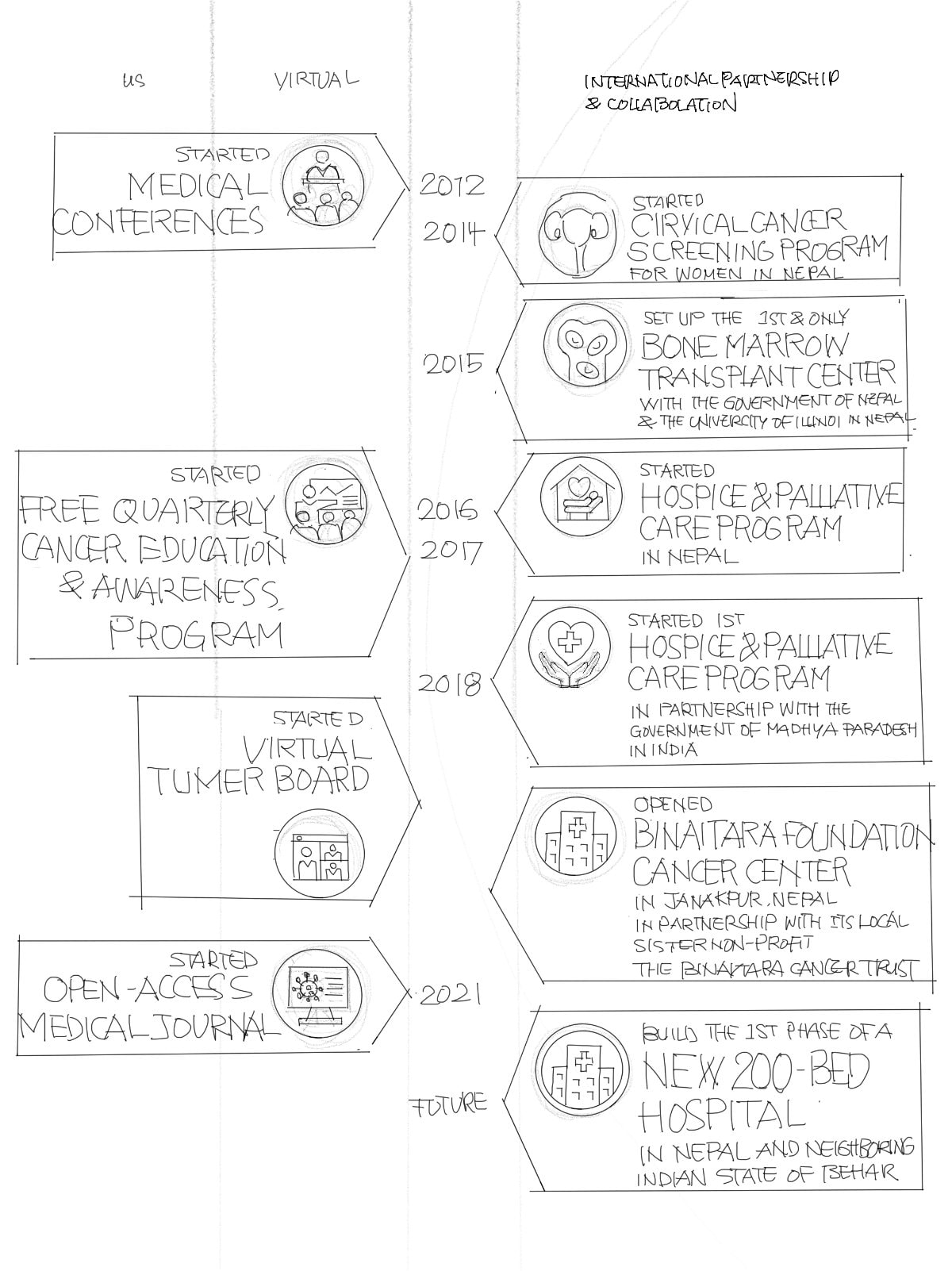
The client had an upcoming major project that involved constructing the first phase of a new 200-bed hospital in Janakpur, Nepal. A fundraising event was also planned. They were looking for a material that illustrates how the organization’s diverse activities align with their mission, making it easier for the public to understand, especially potential donors.
Resources & Materials
After studying the information provided by the client, including their vision, achievements, and future plan, we deconstructed and reorganized the information into separate sheets and a diagram to see the big picture and the relationships between each organization’s achievements and future goals.
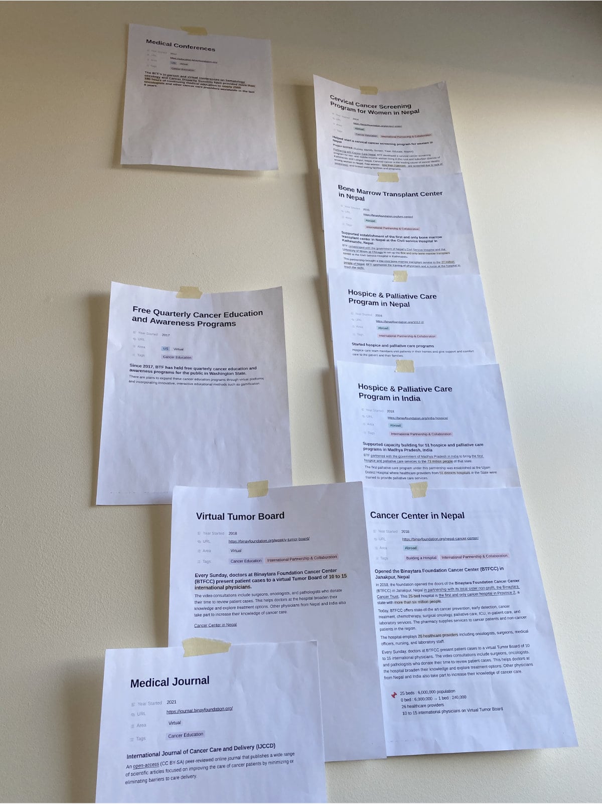
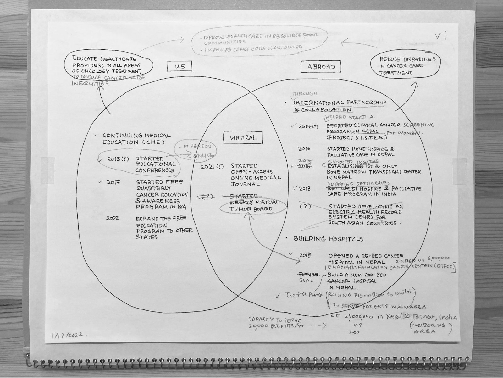
Studying, deconstructing and reorganizing information from the client (left), A diagram summarizing the organization's initiatives (right)
Approach & Outcome
We started by creating a word map of the data and identifying design keywords. Next, we focused on determining the most effective way to present this information in alignment with those keywords. Our goal was to help the public, including potential donors, clearly understand the organization's efforts, achievements, and current focus.
As a result, we created infographics that effectively communicate essential data about the hospital project, incorporating visuals related to Nepal and its neighbouring regions. Additionally, we designed a chronological infographic with icons to summarize the organization's efforts and accomplishments.
Detailed sketches
Applications & Tools
Adobe Illustrator
Goals & Challenges
This was a product pre-launch project for M!nder, an intelligent theft-deterrence system for Bicycles. As this product did not yet have a proven market, the client was hoping for only quick work rather than a deeply contemplated creation. However, we needed to ensure that the logo would be versatile enough for future packaging and other applications. The client preferred that the logo not focus on theft; instead, his vision centered on the love of one’s bicycle. He was also open to any other inspirations that might spark the designer's creativity.
Resources & Materials
Grasping the product's concept and the reasoning behind its name was crucial. Since the product name had not been finalized at the start of our project, we concentrated on creating a graphic representation that would resonate with the product and align with the client's vision of a "love of bicycles."
Approach & Outcome
As logo designers, we developed three design concepts.
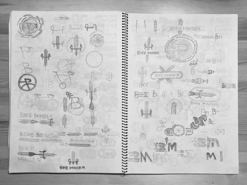
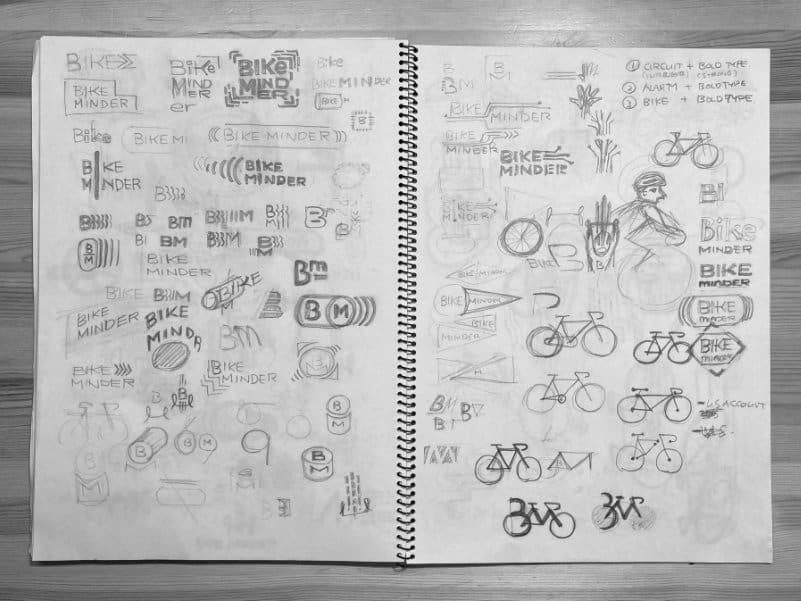
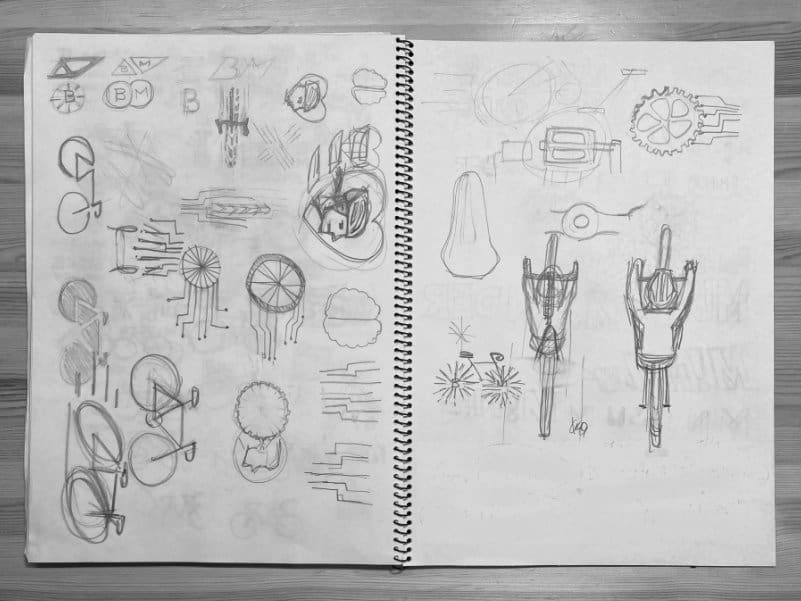
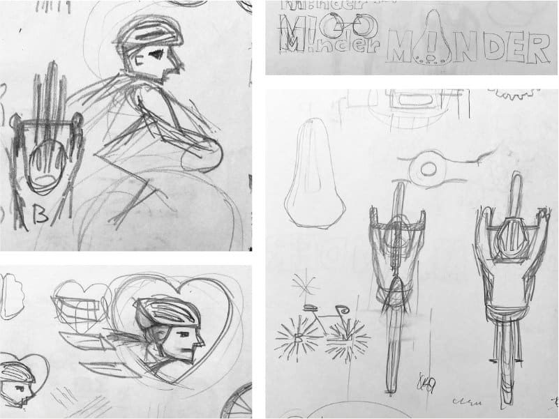
Design exploration
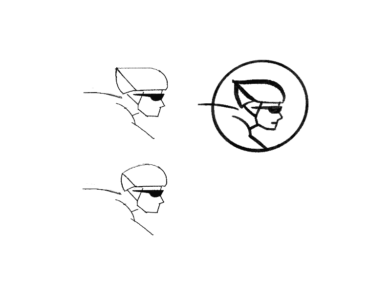
Initial sketch (left) and variations (right)
The client appreciated both the text and illustration of design A. He found the lower-case letters particularly effective with the exclamation mark and the concept of ‘love.’ The client also liked how the illustration was more dominant compared to the name.
Applications & Tools
Adobe Illustrator, Affinity Designer, Artboard Studio
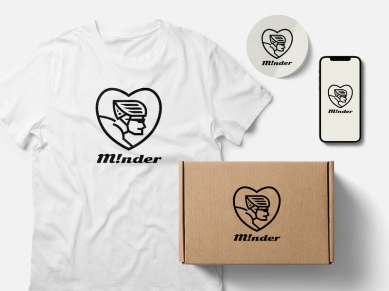
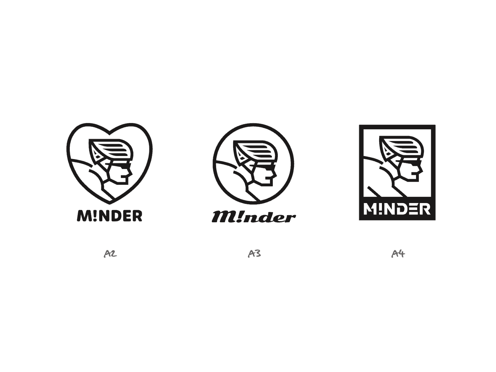
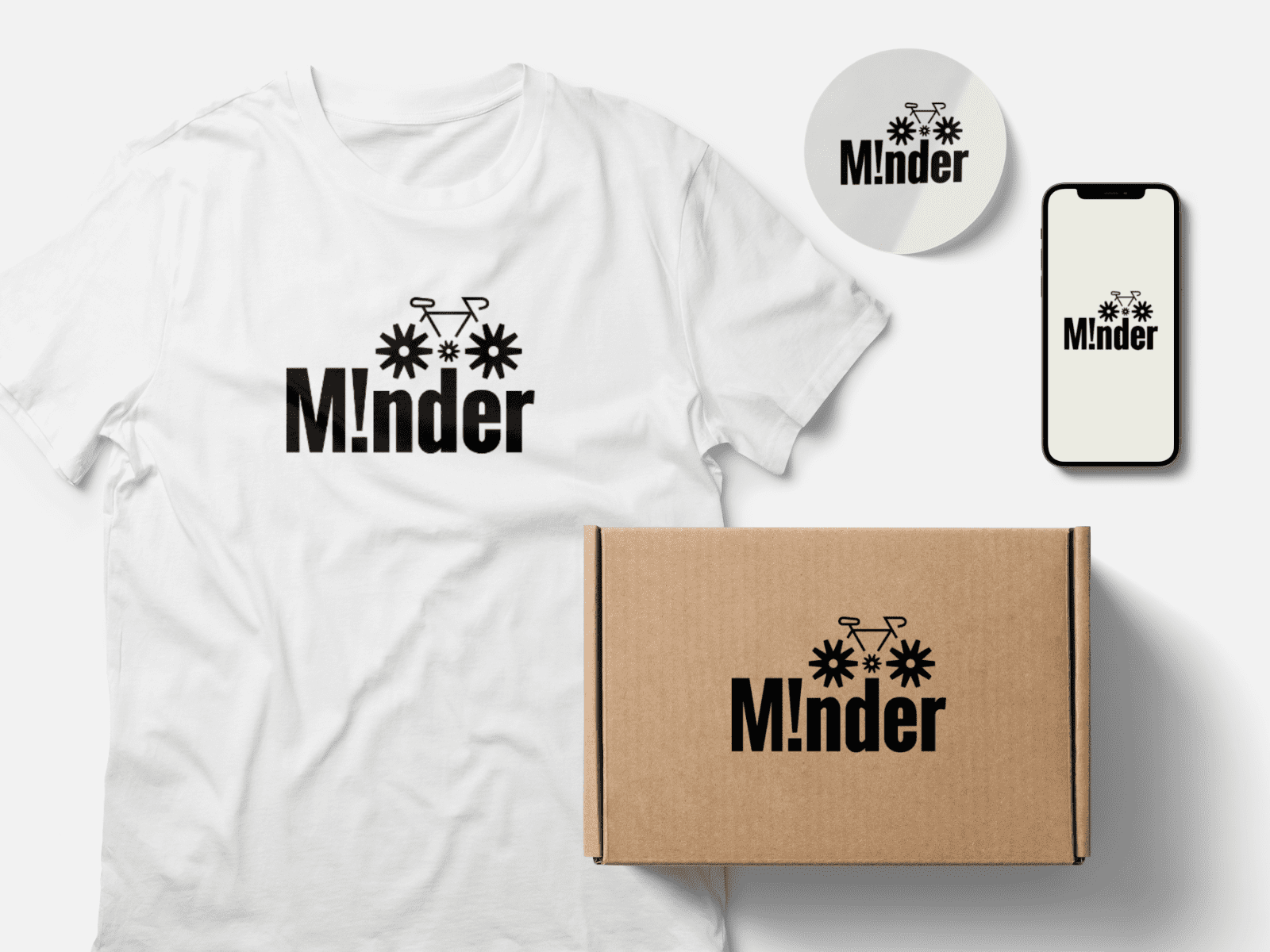
Design A (selected)
Inspired by cyclists’ love for bikes and cycling, we used bold shapes and lines, along with a strong slant font, to represent reliability, robustness, and the feel of the wind.
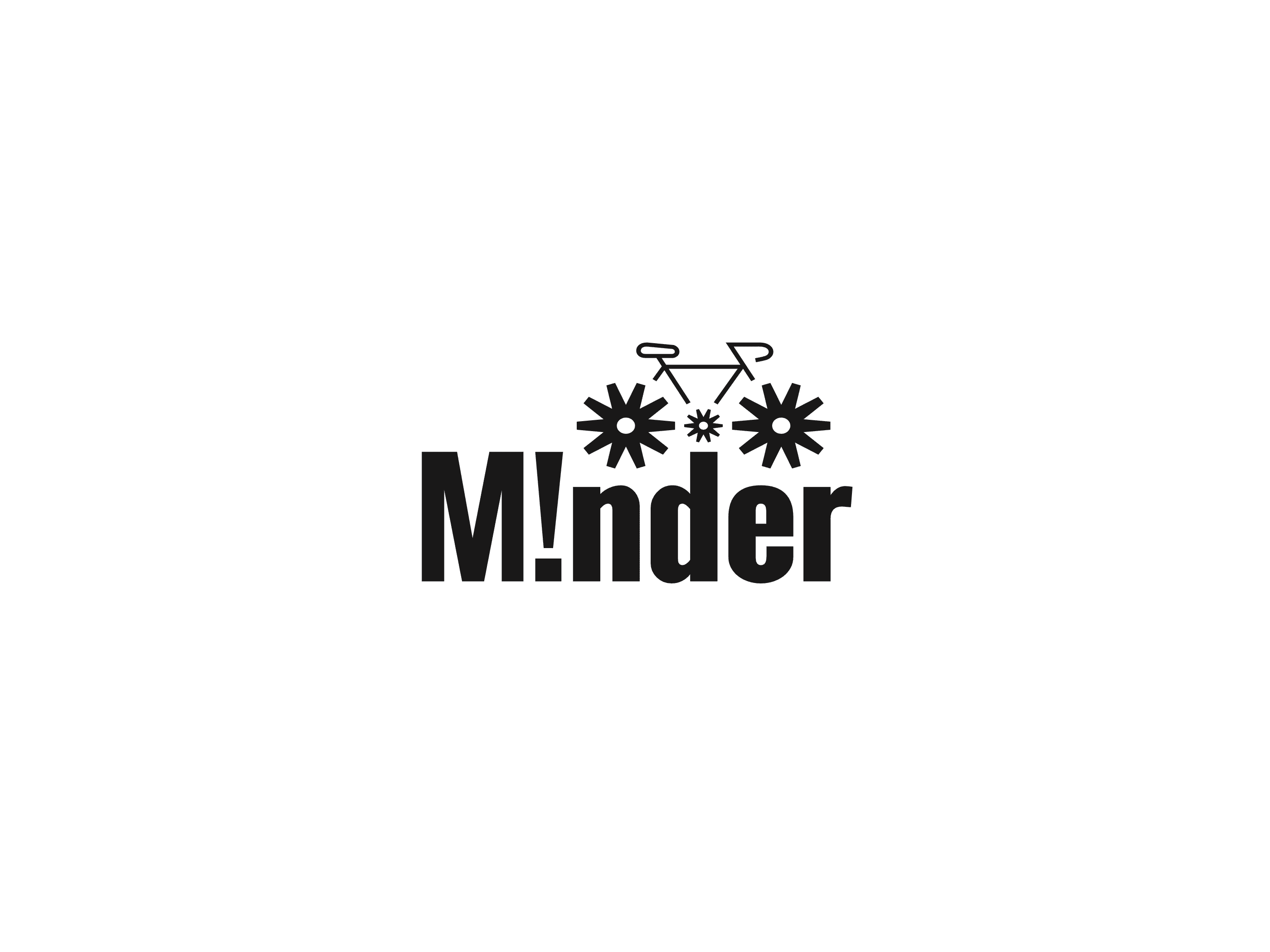
Other Presented Design - B
Drawing inspiration from bicycles, we incorporated asterisk symbols to symbolize simplified wheels and alertness, while the bold fonts convey reliability and robustness.
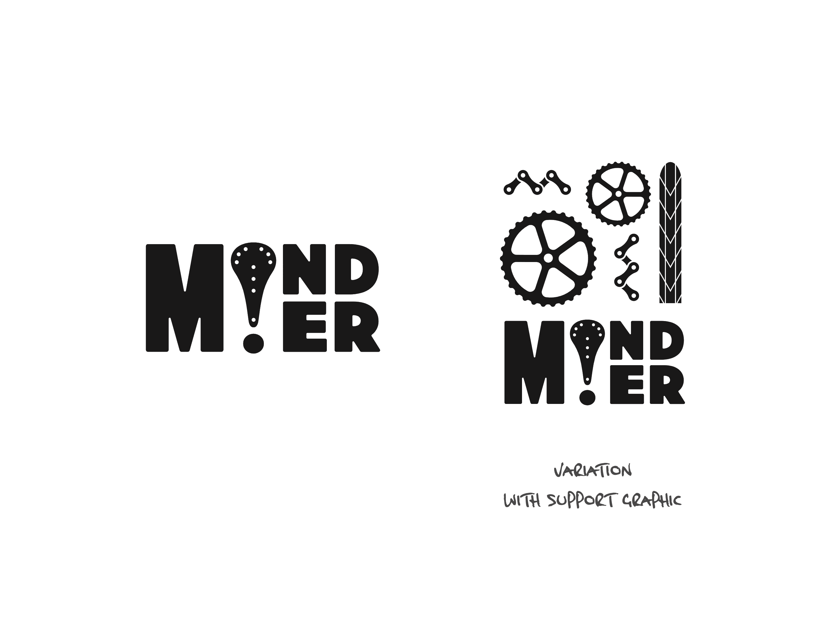
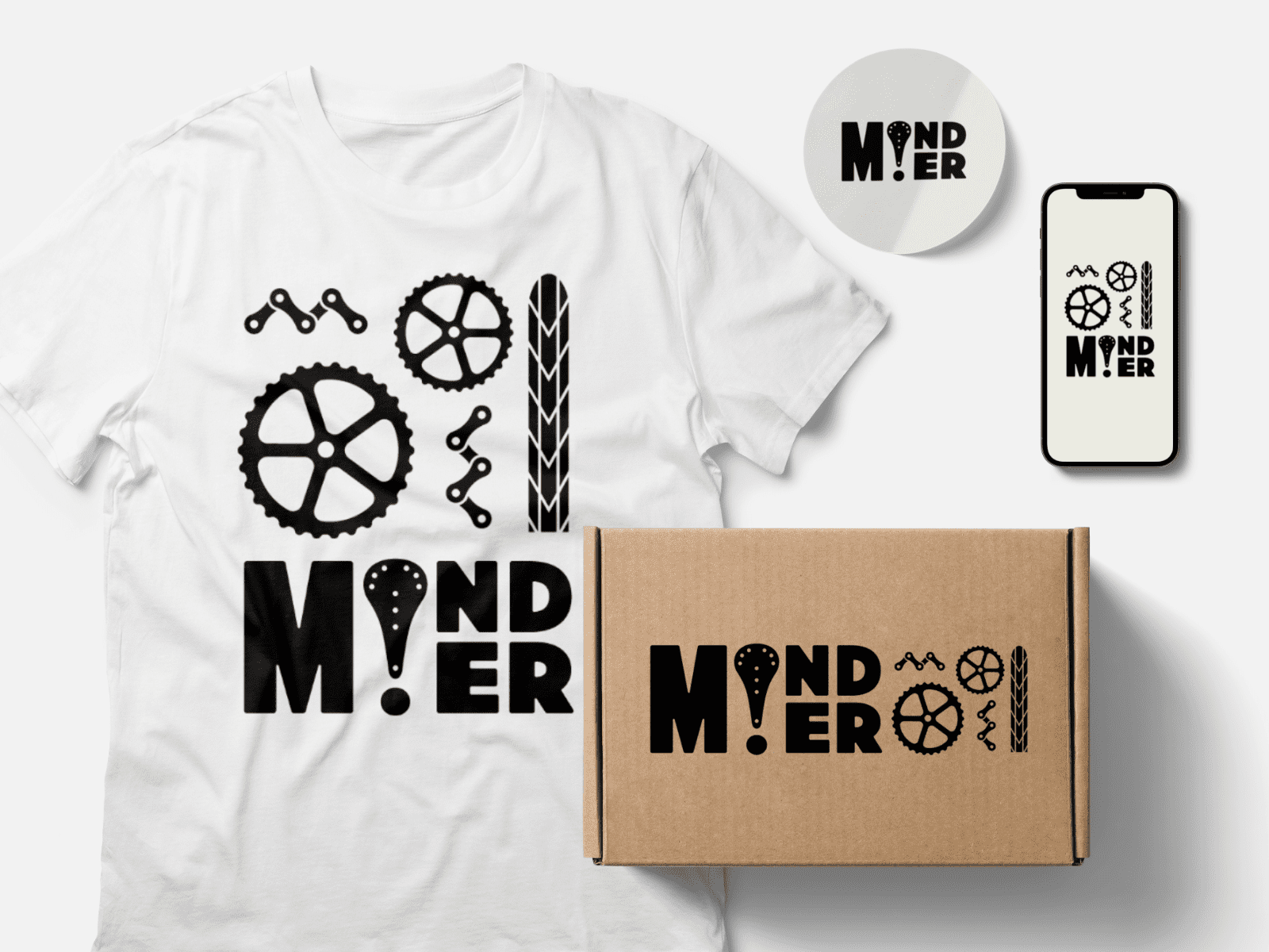
Other Presented Design – C
By combining an exclamation mark and a bike saddle, we created a design that uses bold fonts to represent reliability and robustness. This concept may work effectively with or without a supporting graphic of bike parts illustration.
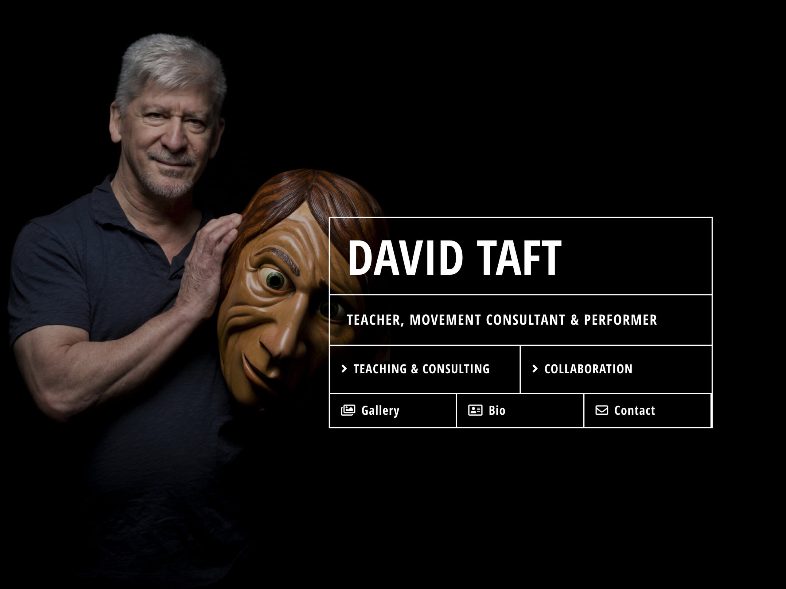
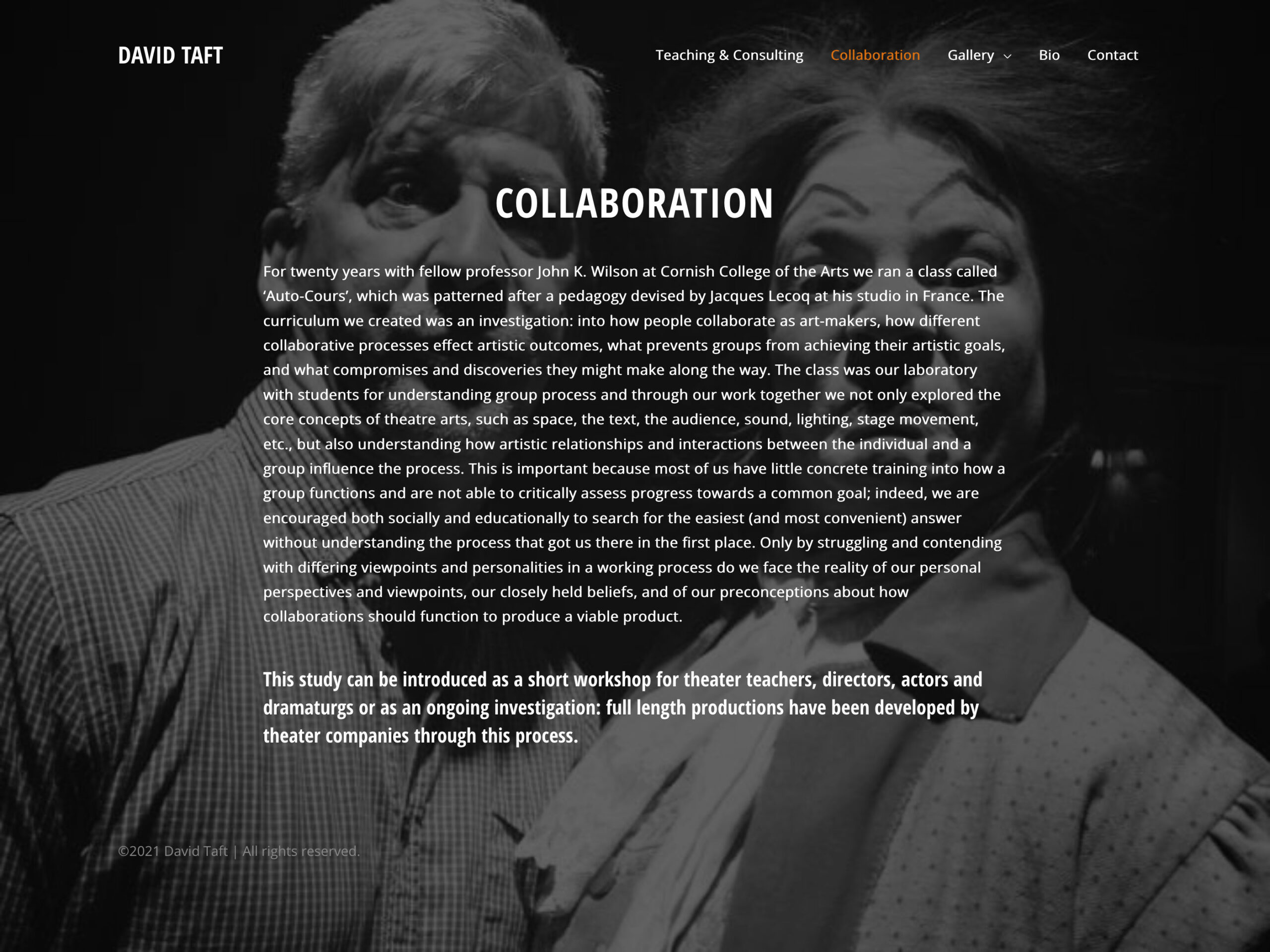
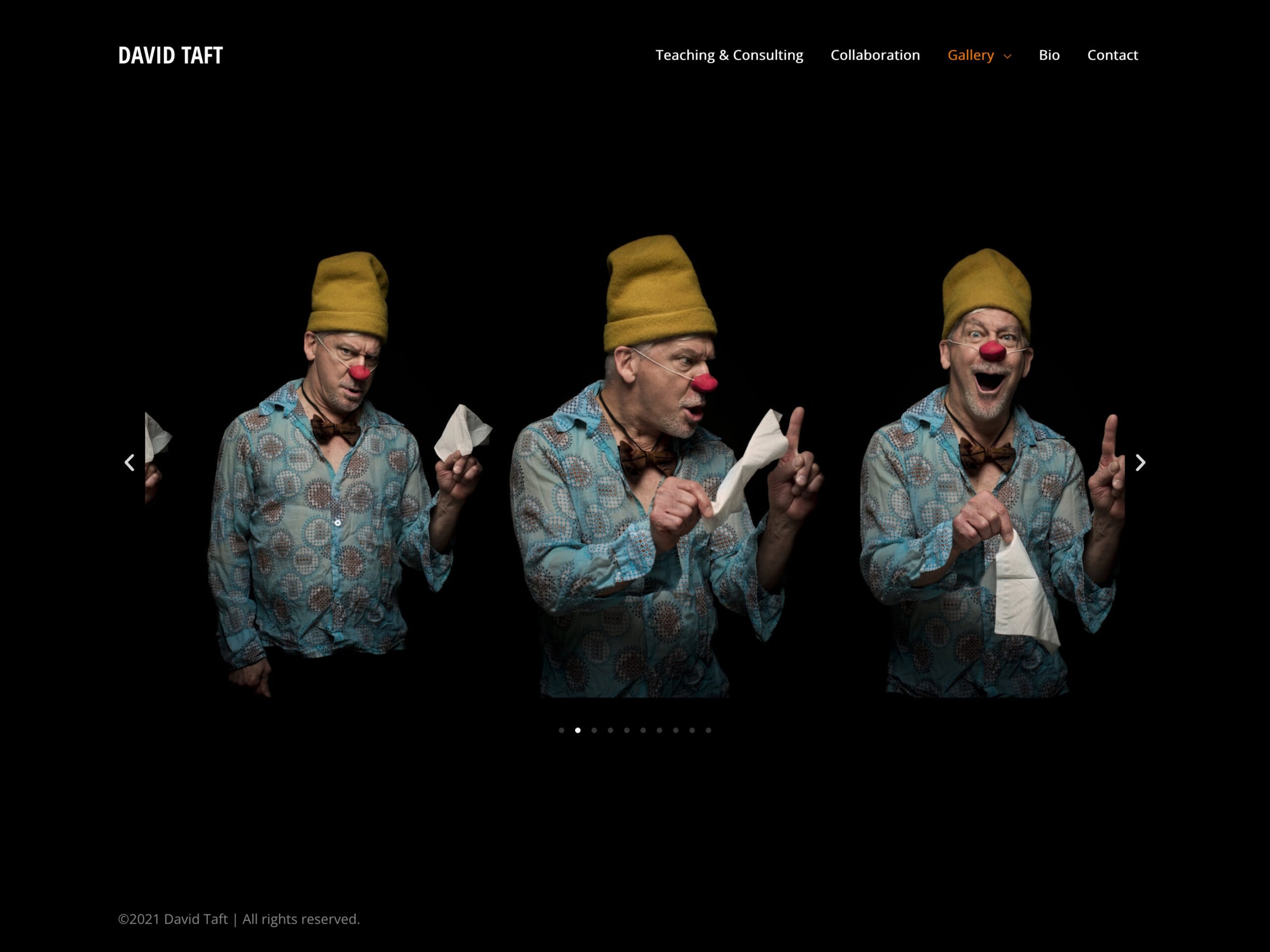
Prof. Taft is a professor of movement at Cornish College of the Arts in Seattle. He works primarily with students in the Theatre Department. It was a pleasure working with inspiring photos.
Applications
Affinity Designer, Affinity Photo, Figma, WordPress
Goals & Challenges
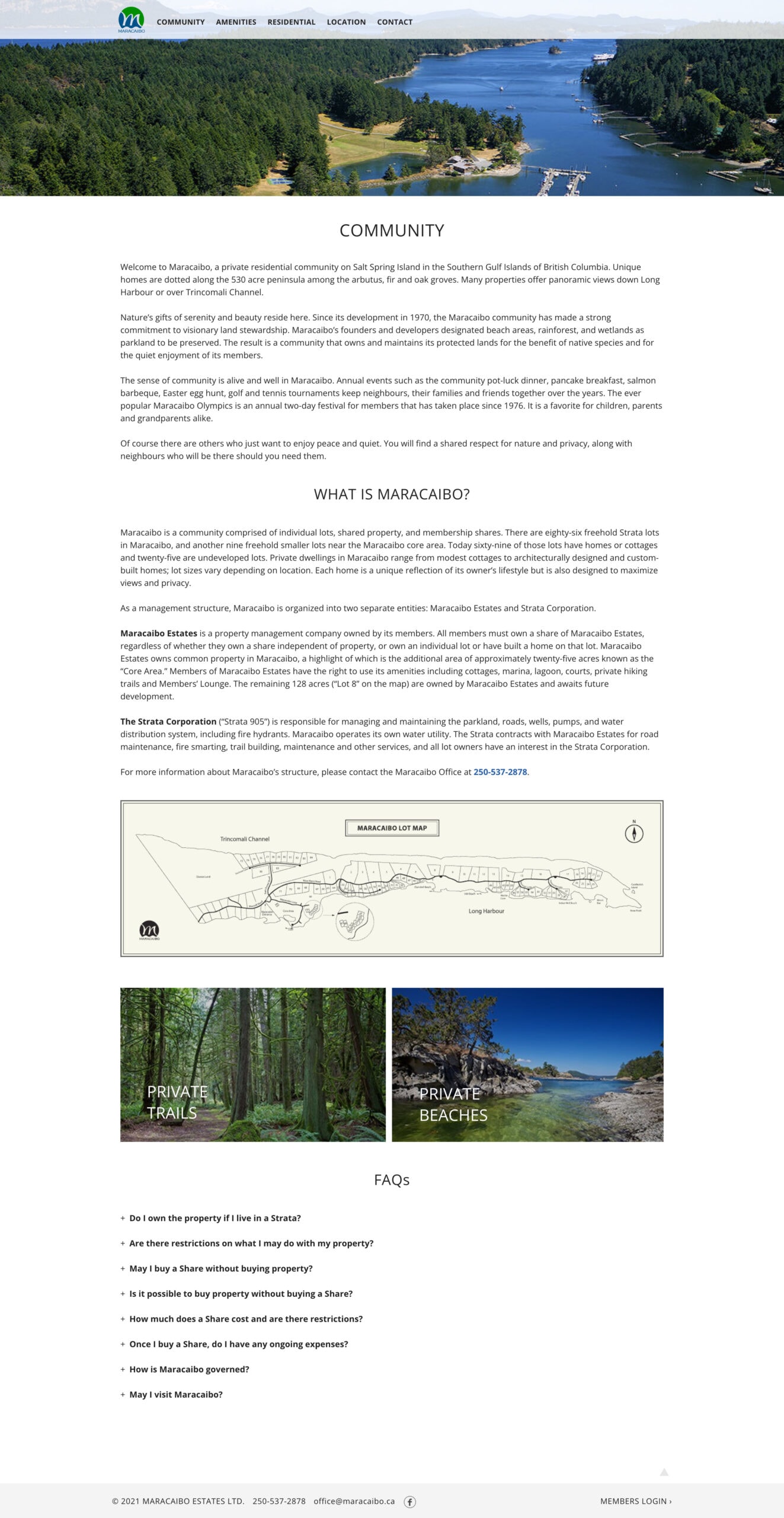
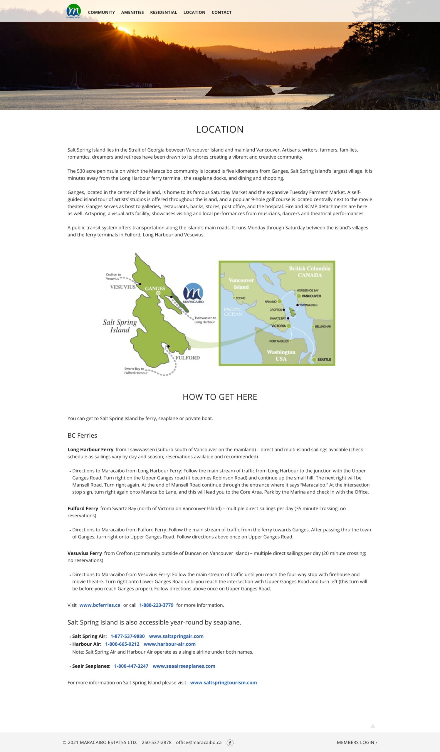
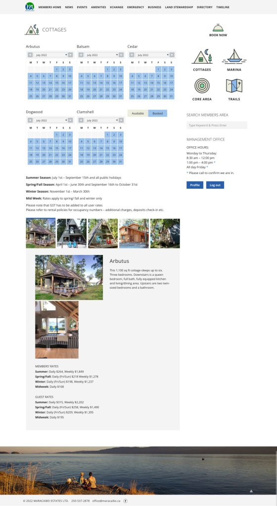
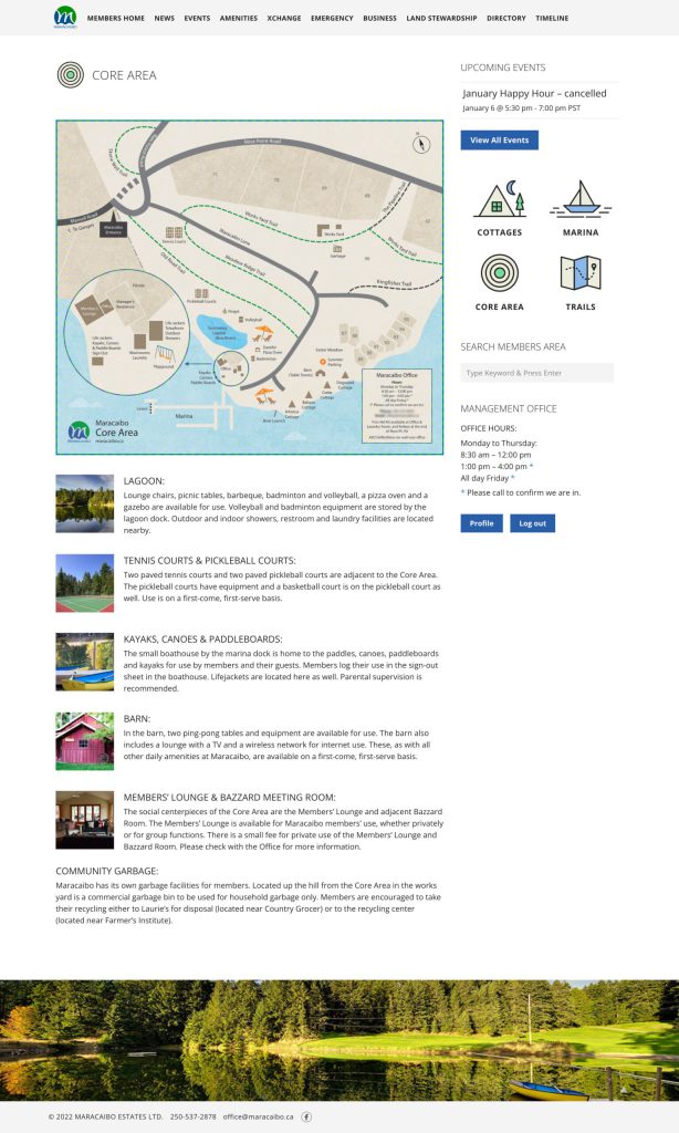
Maracaibo Estates is a private residential community that offers individual lots, shared property, and a membership program. Approximately 150 members enjoy access to a variety of common facilities, including cottages, a marina, a lagoon, sports courts, private hiking trails, and a members’ lounge.
The client was looking for a new website to promote the estate to the public and provide members with cottage booking capabilities, access to documents, and better communication options.
Many members were seniors, and we understood the potential challenges they might face with technology. Our goal was to enable every member, regardless of their technical skills, to access information and actively engage with our services online.
Resources & Materials
The client conducted a survey and identified several important issues.
- Many members didn’t even know the website existed.
- The management office and some members felt a new website could reduce paper and analogue work.
- The new website needed to serve two purposes: promoting the property to potential buyers and allowing members to find internal information and possibly communicate with other members.
- The new website needed visual improvement.
The client provided photos that highlight the property's natural surroundings and architectural features.
Approach & Outcome
We collaborated with the project committee members and the strata councils from research, planning, and presentation at their AGM.
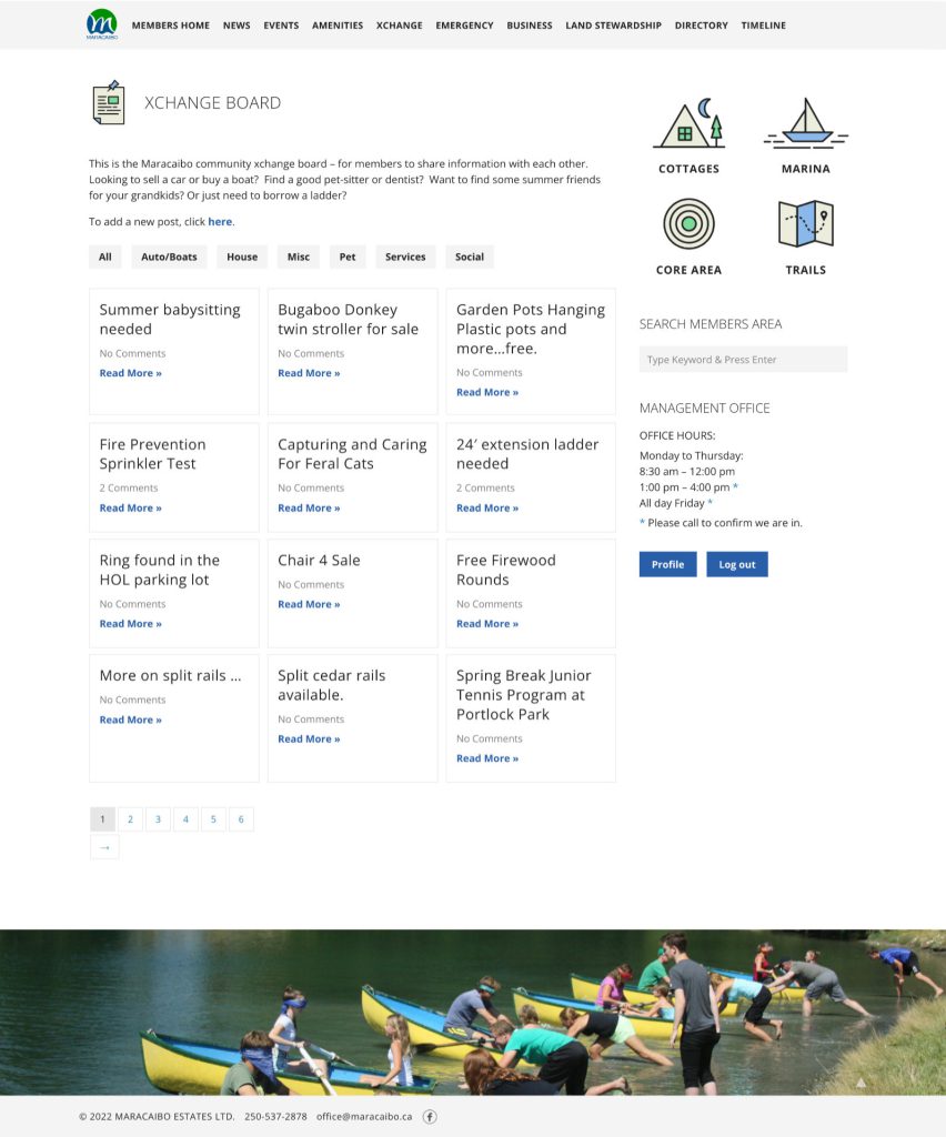
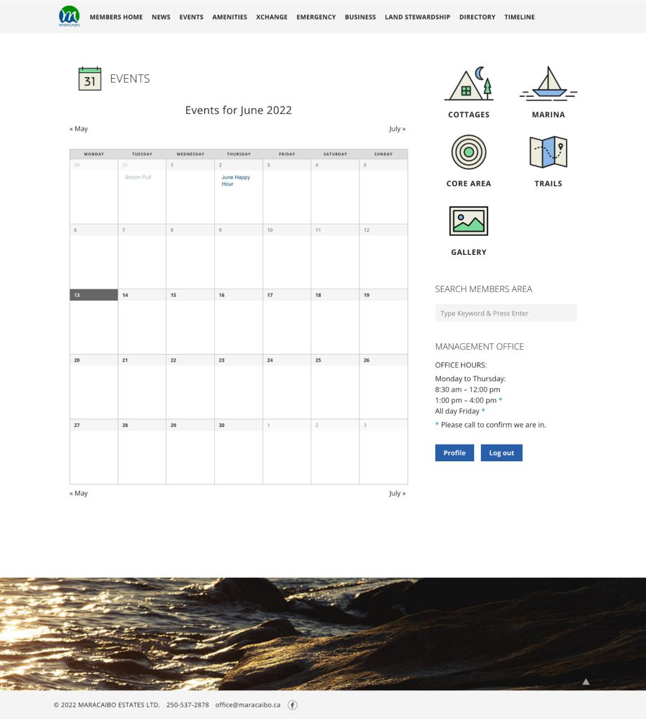
We created a public website that showcases the beautiful property and its amenities, providing all the necessary information for potential buyers. We also developed a password-protected site for members, allowing them to cover their wish list with features such as larger text sizes, clear instructions, and simplified menus to ensure a comfortable browsing experience.
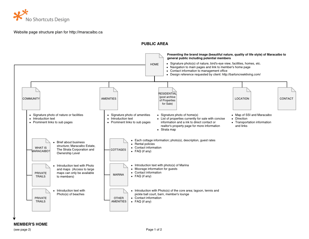
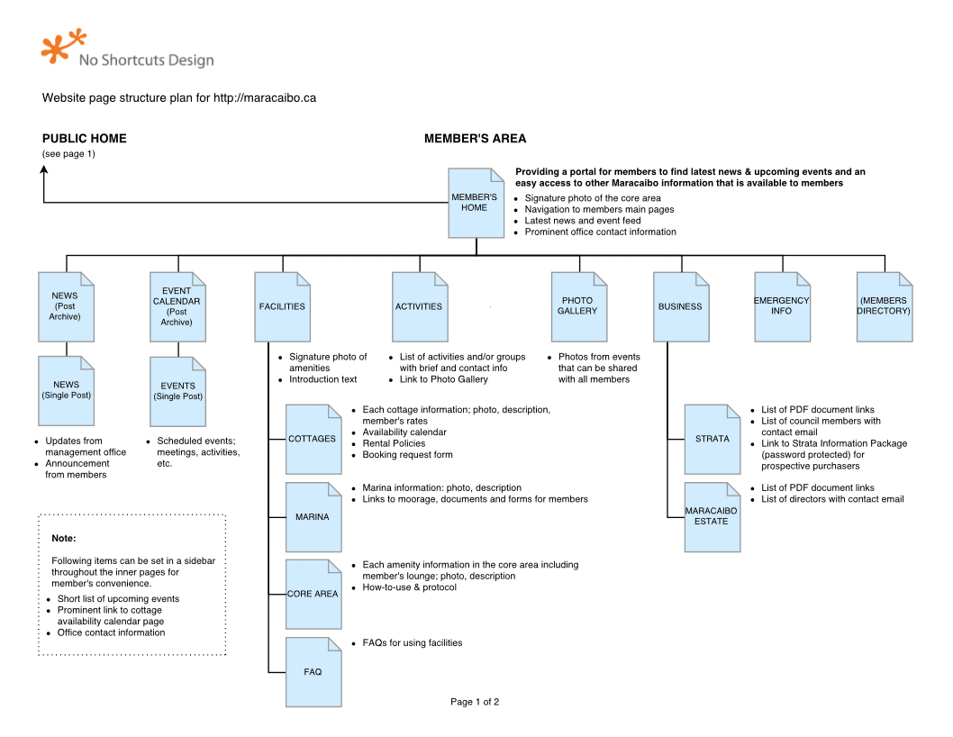
Site structure plan
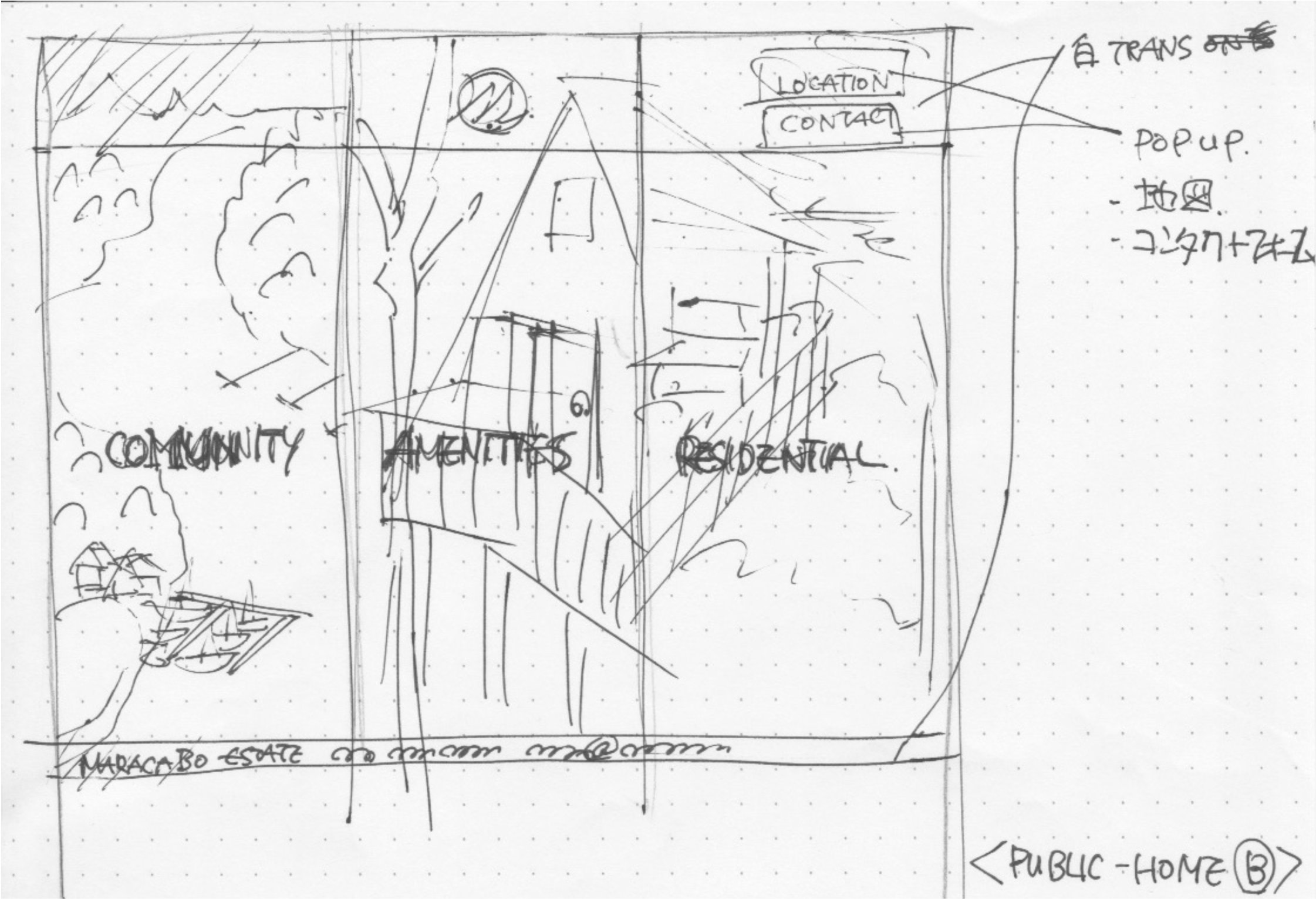
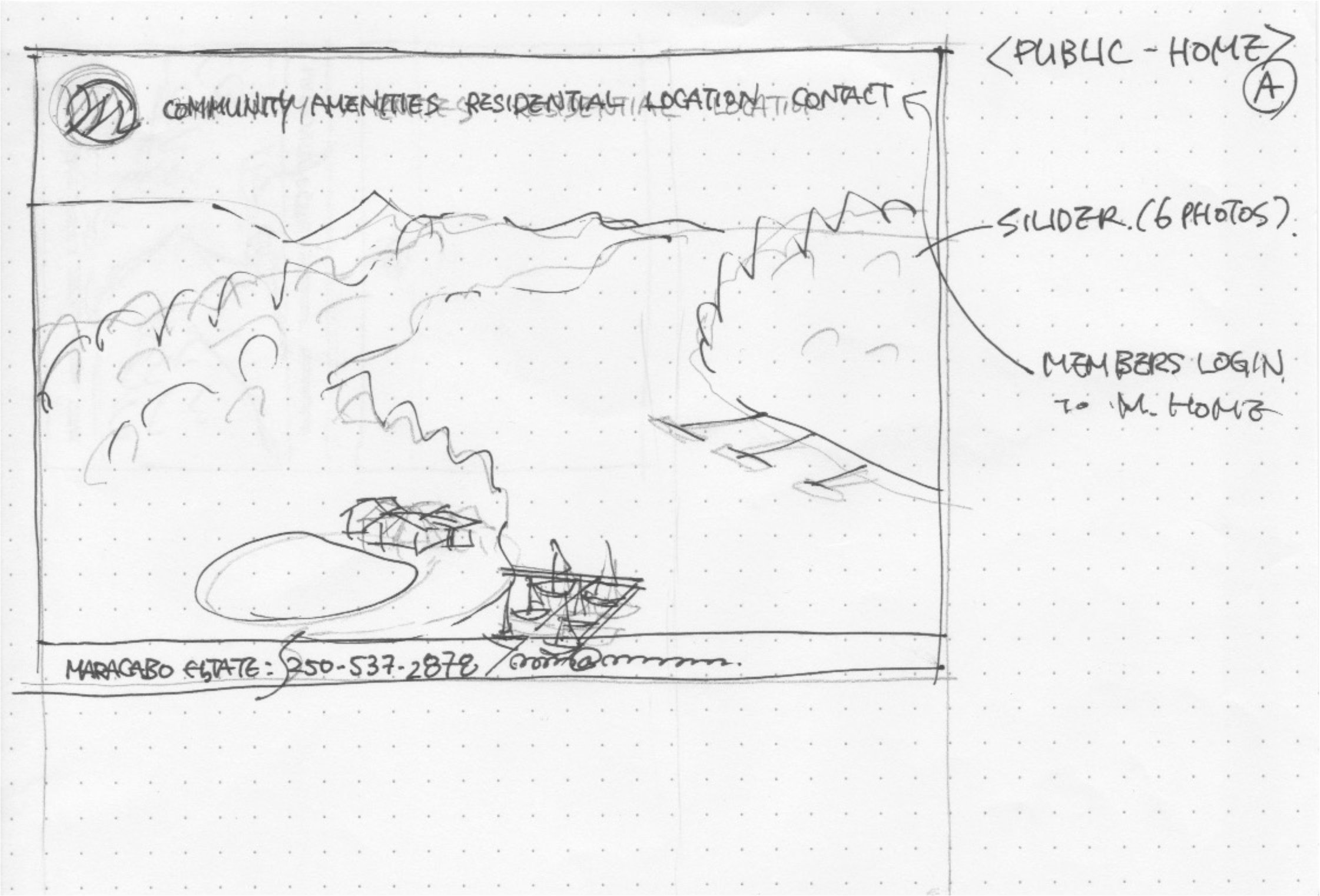
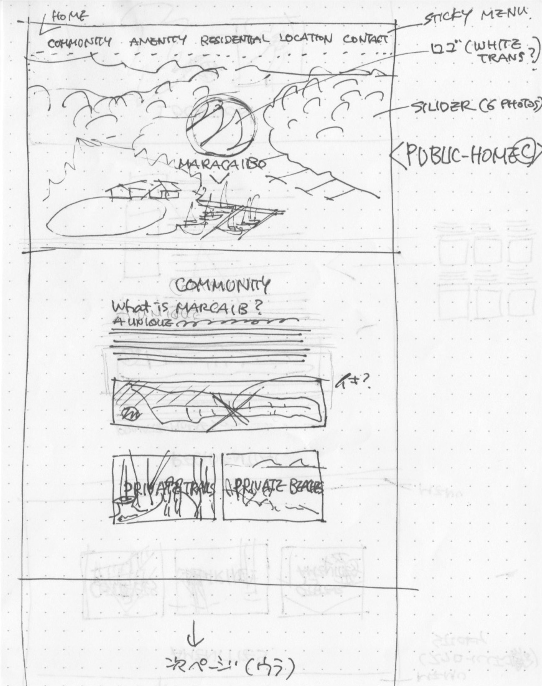
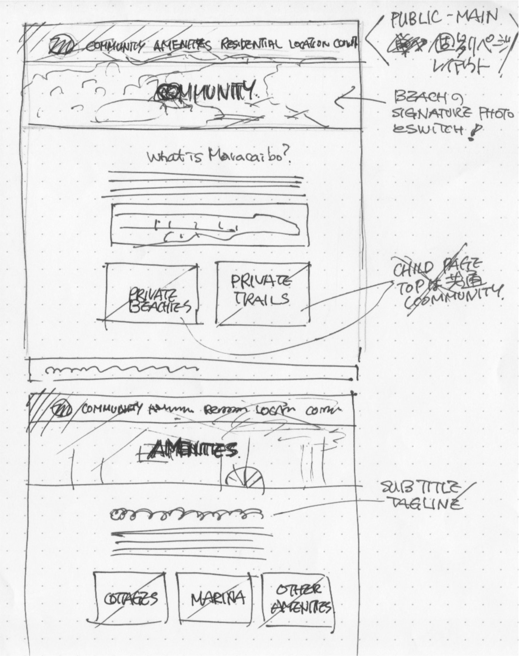
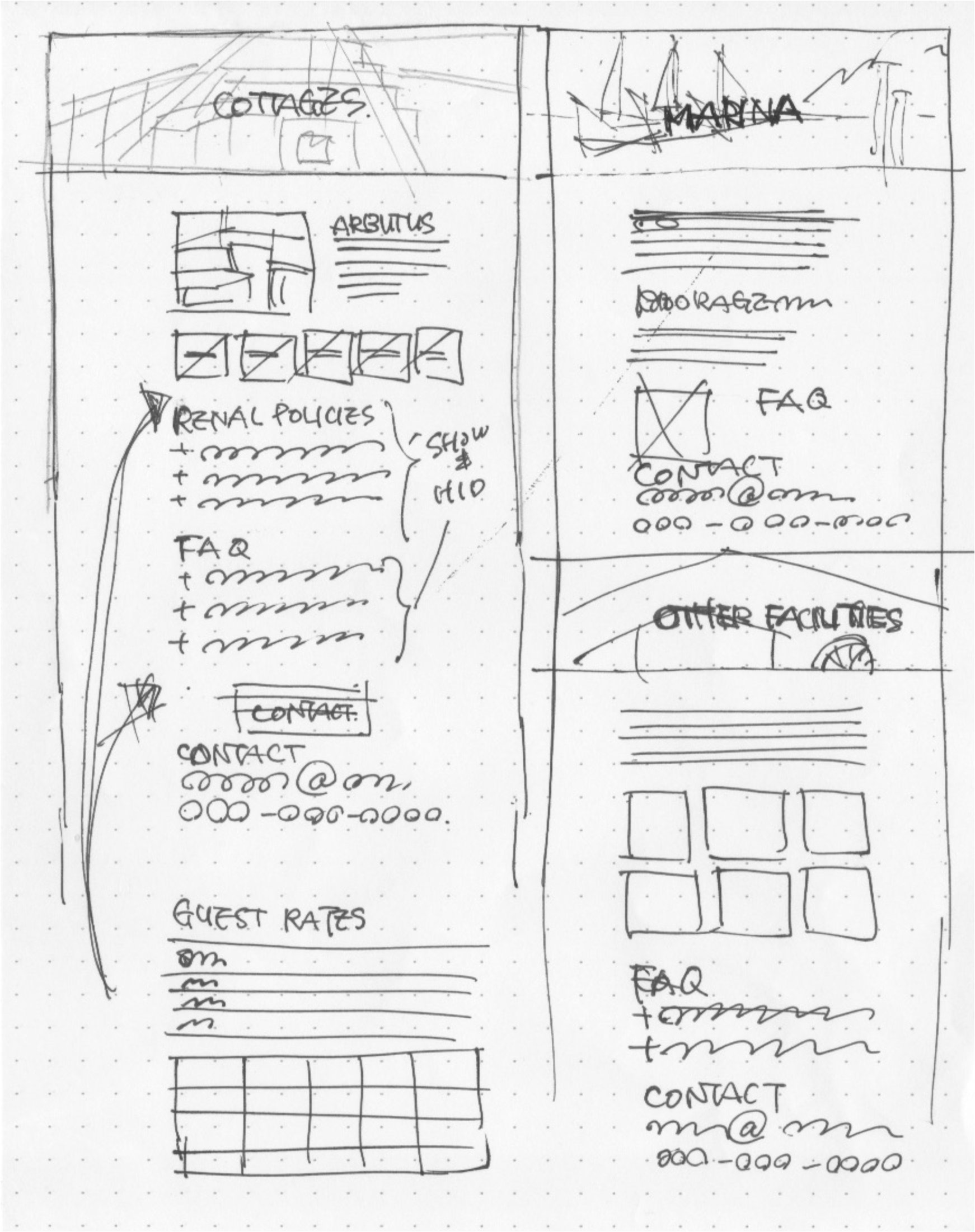
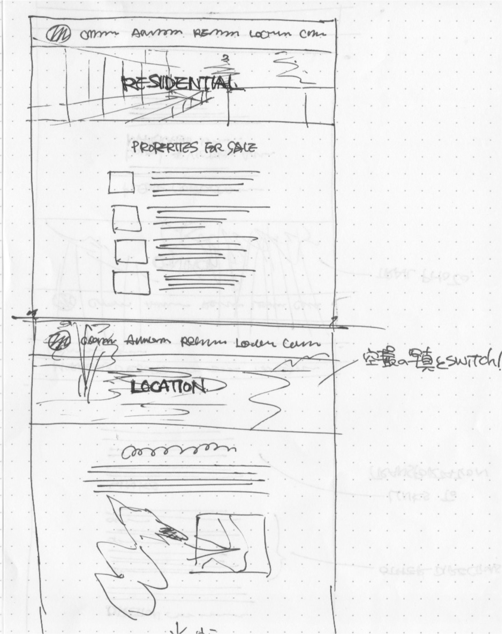
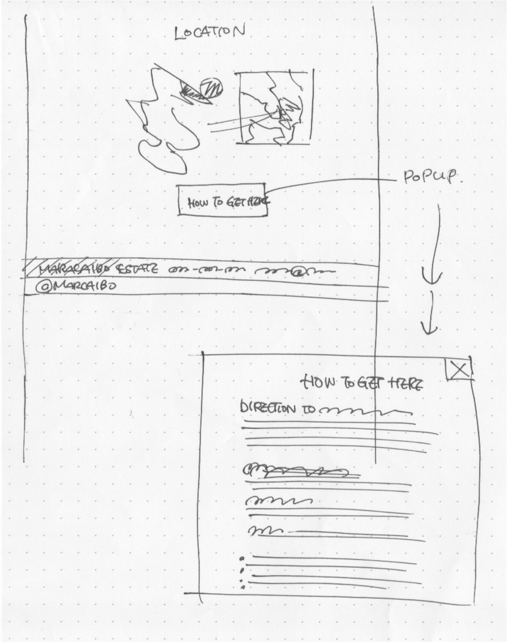
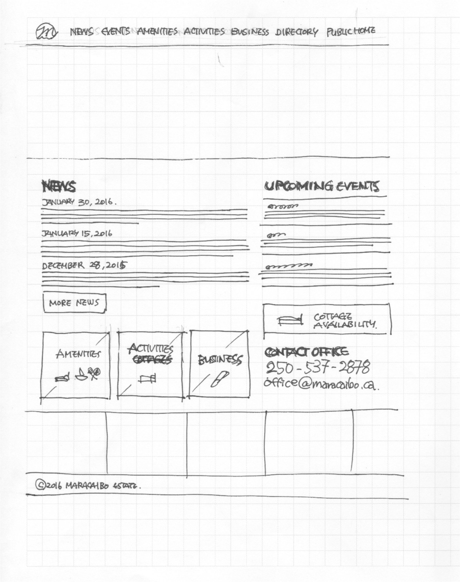
Early stage sketches
At the Strata AGM, we presented the website alongside the website project committee and conducted a group instruction session, along with individual sessions after the site launch.
With the new website, members can easily find updates from the office, access business documents, and use a member directory. They also have the ability to check the availability of cottages and make bookings. As members became more comfortable using the website, they requested the addition of a bulletin board for information exchange. This board can include lost and found notices, recommendations for housekeeping services, invitations to gatherings, and more. The project enhanced the workflow of the management office and transformed how members find information and communicate with each other on a daily basis.
As a derivative project, we were commissioned to design a new trail map that includes updated information for members and visitors, including children.
Applications & Tools
Adobe Illustrator, Adobe Photoshop, Affinity Designer, WordPress
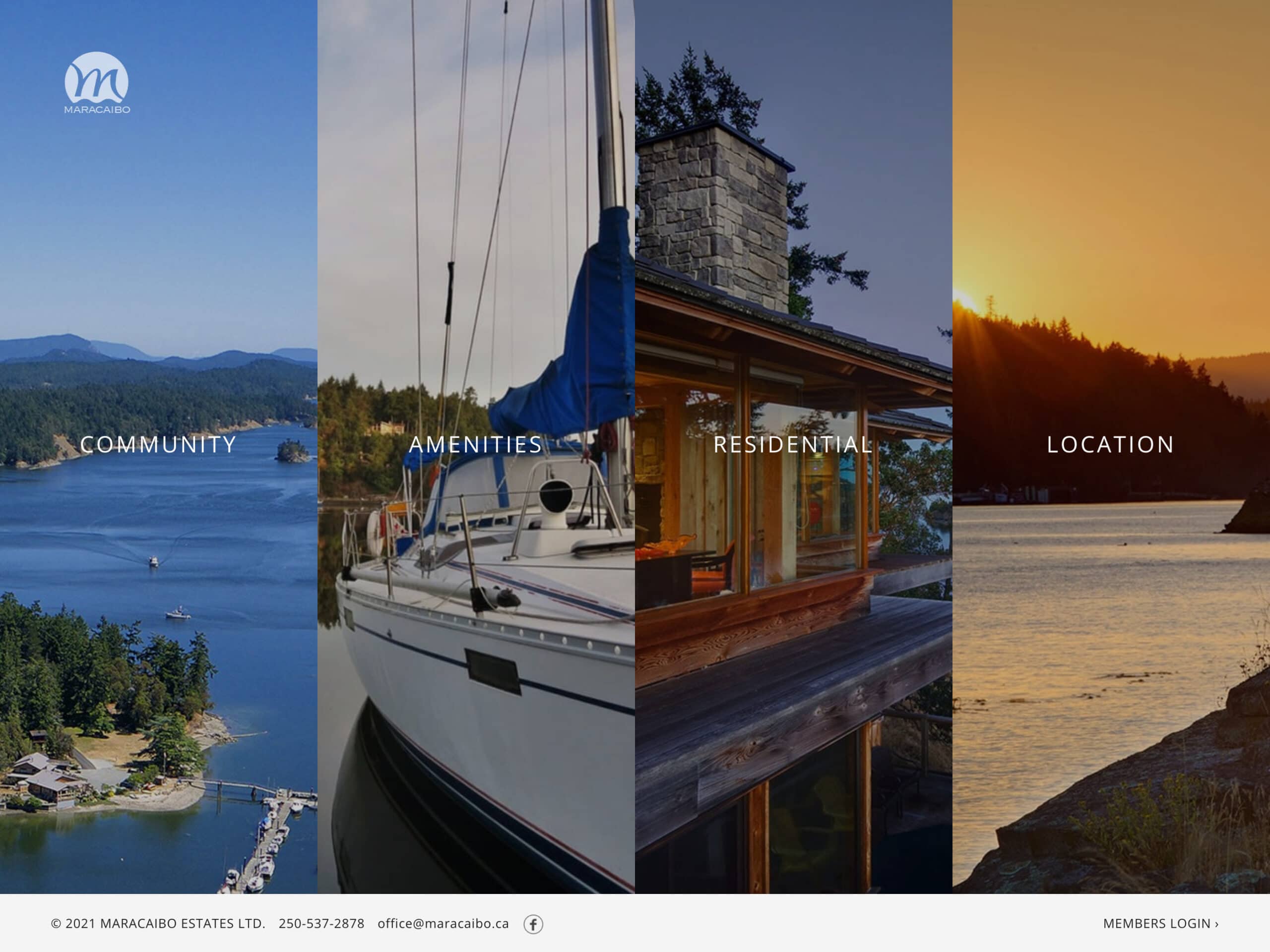
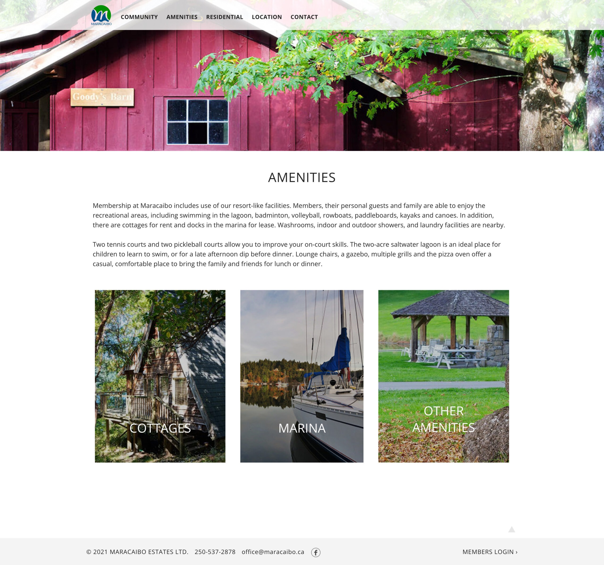
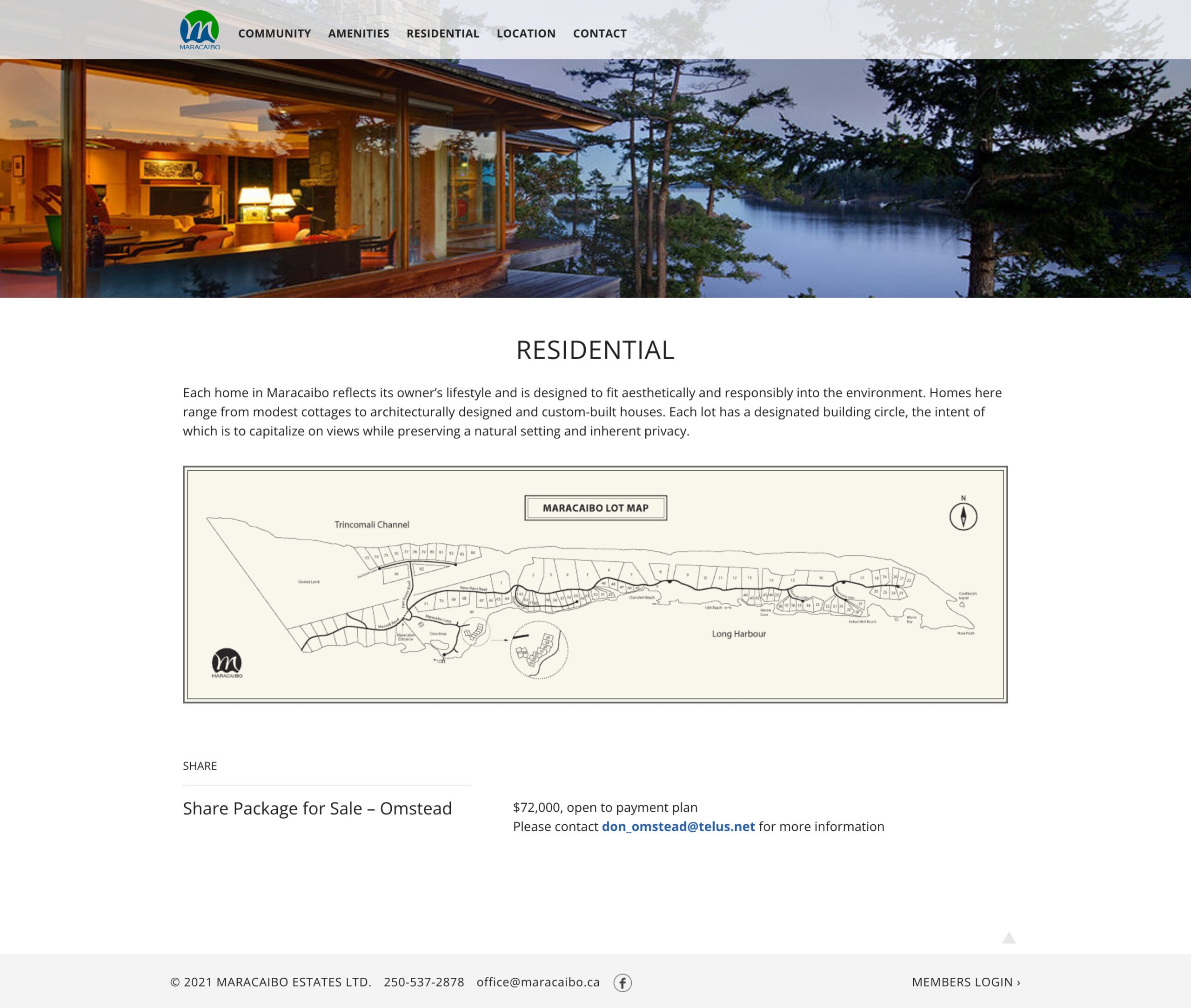
Public site pages
Members site pages
Icons created for website and trail map
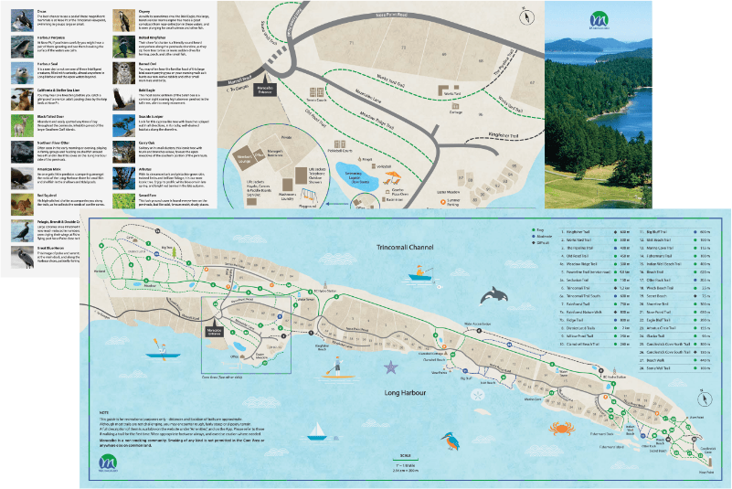
Trail map